Lecture with Stuart Tolley
Edward Fella: Letters on America by Lewis Blackwell
Signs, Lettering and Environment by Phil Baines
The Acceleration of Cultural Change by Alexander Bentley and Michael O’Brian
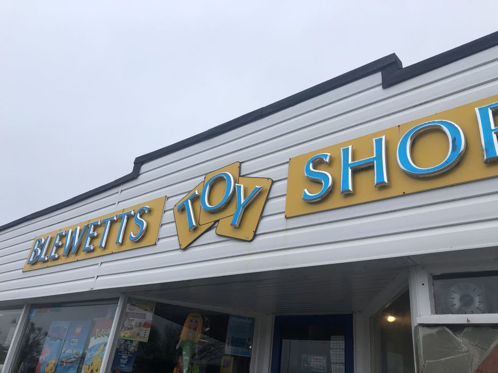
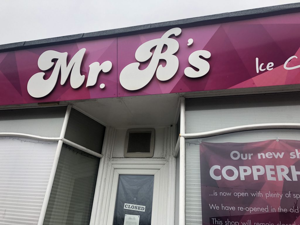
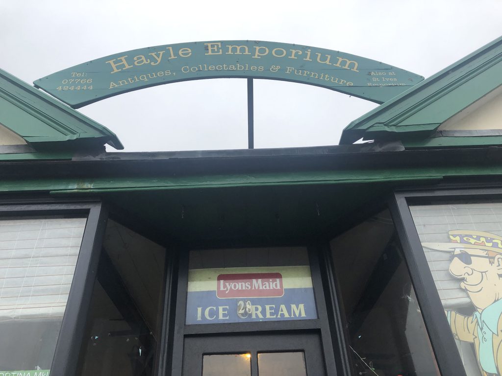
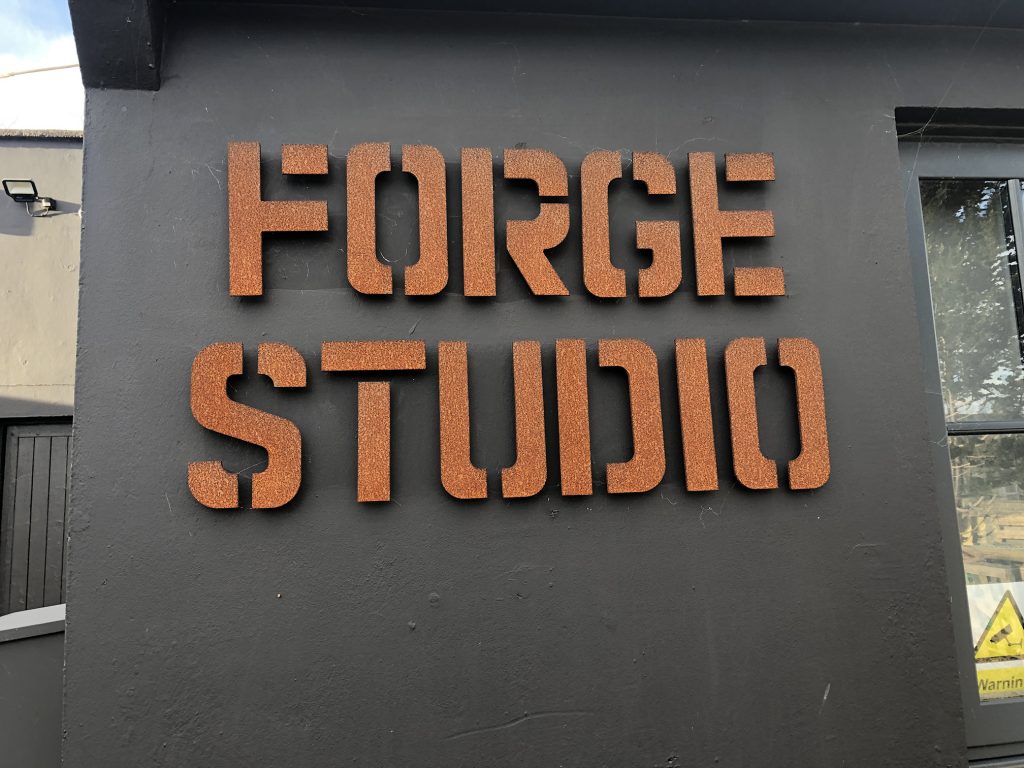
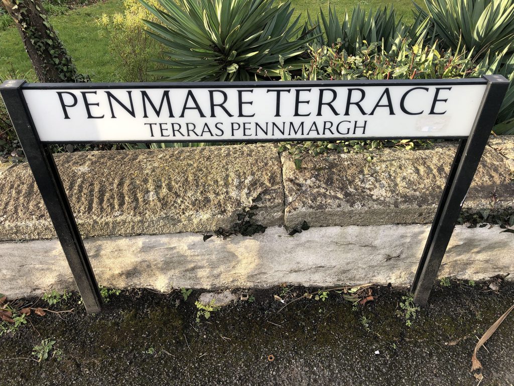
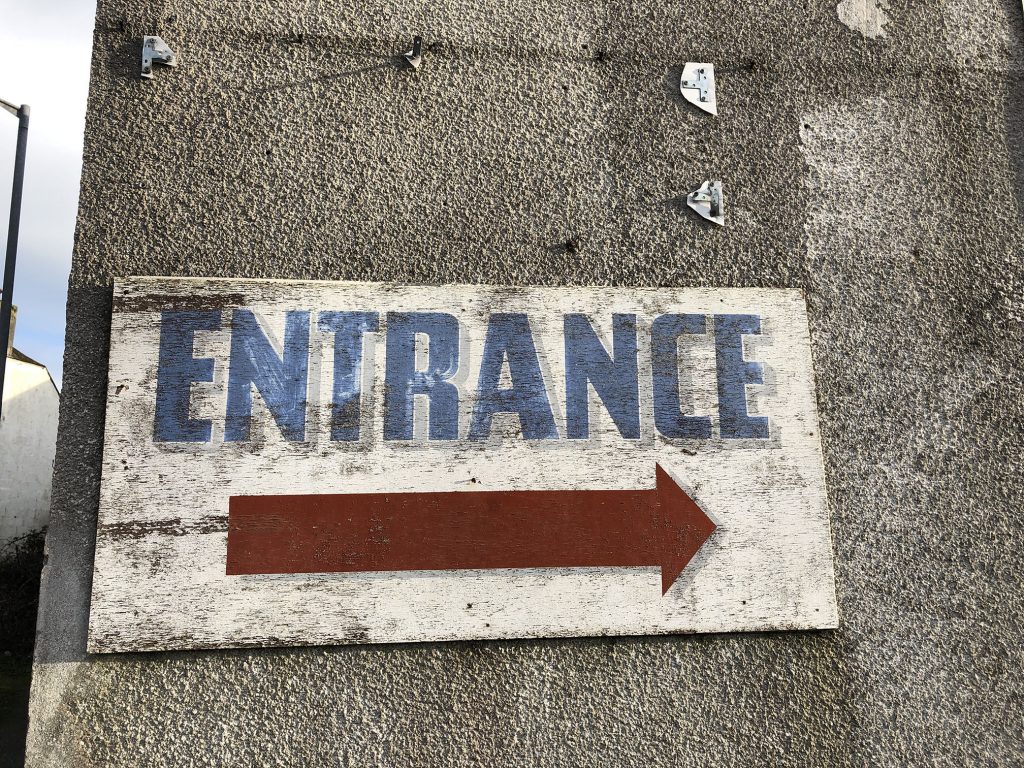
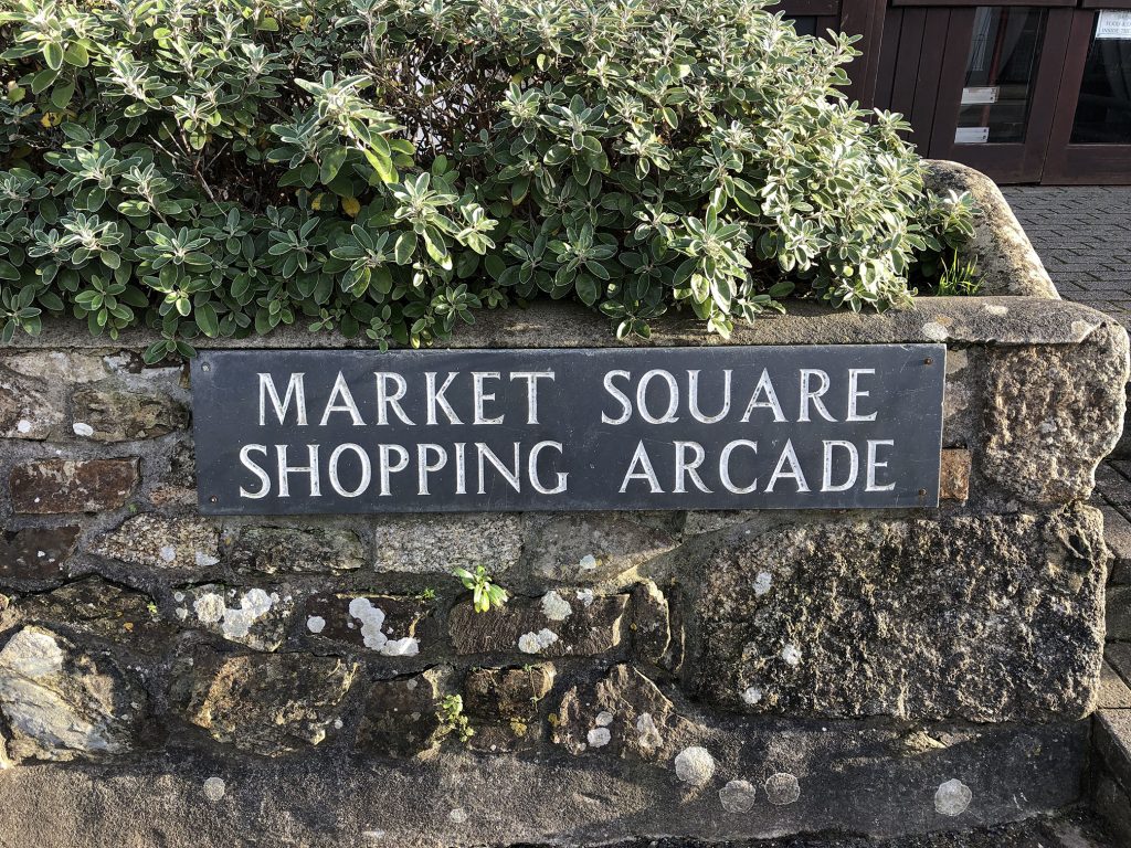
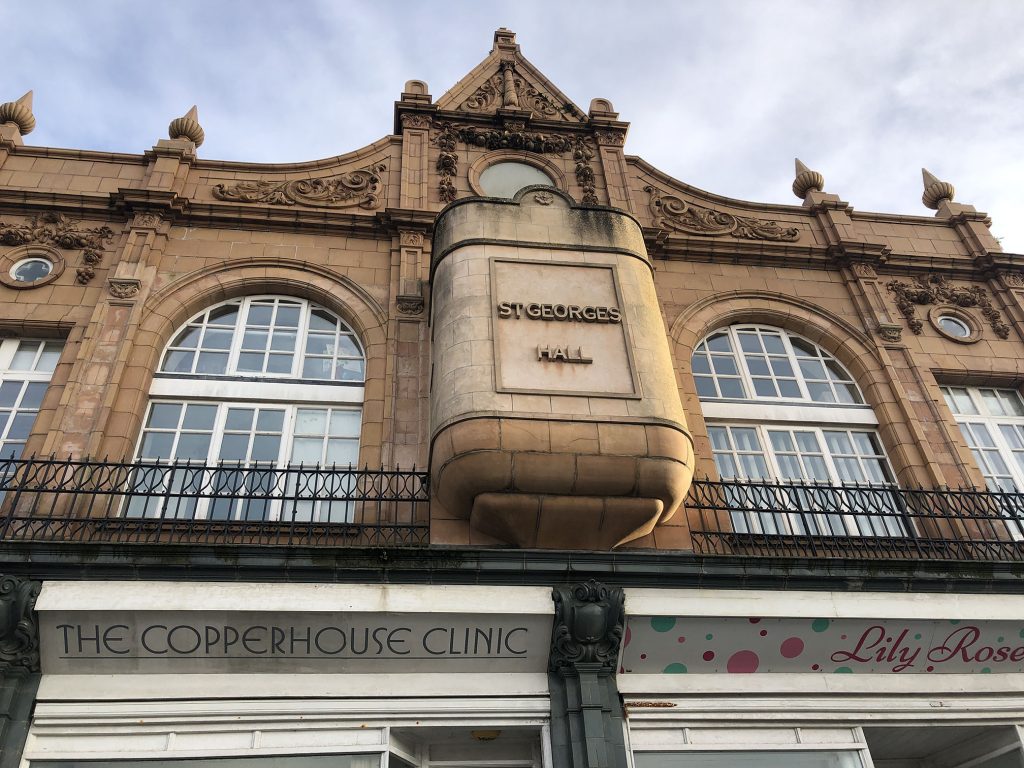
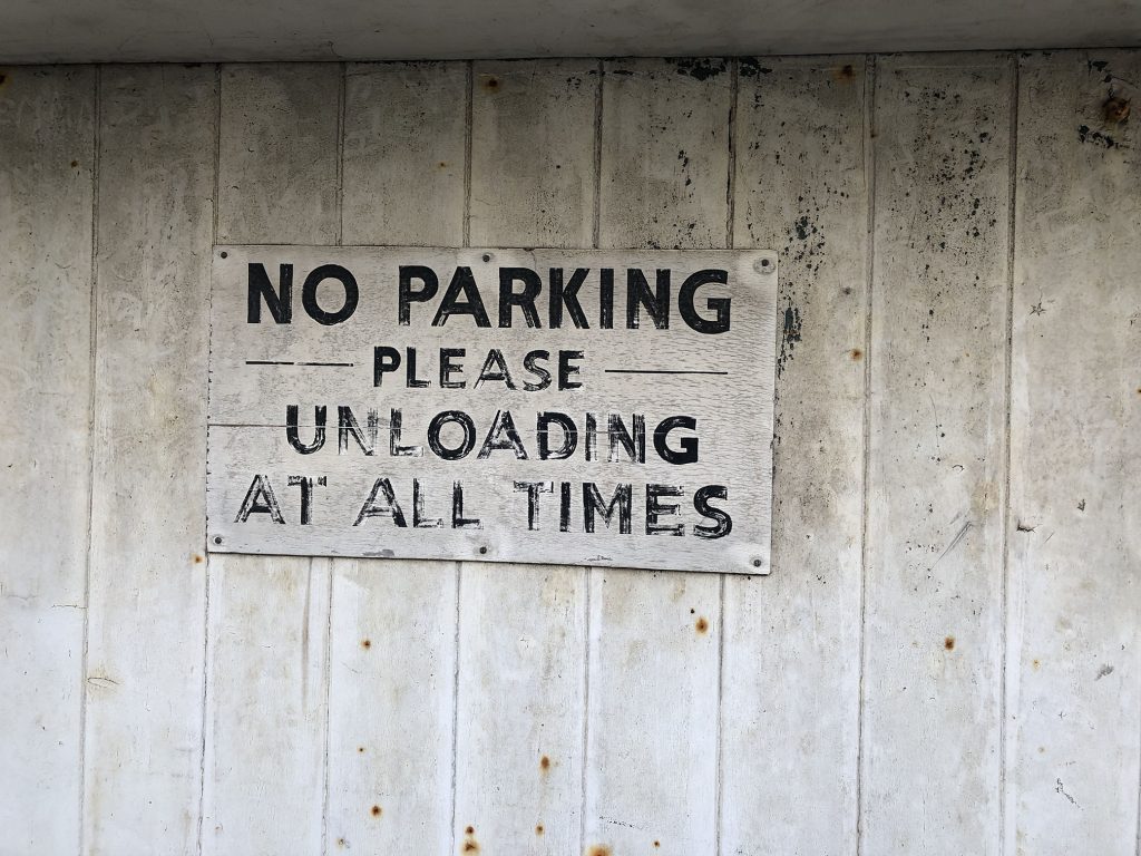
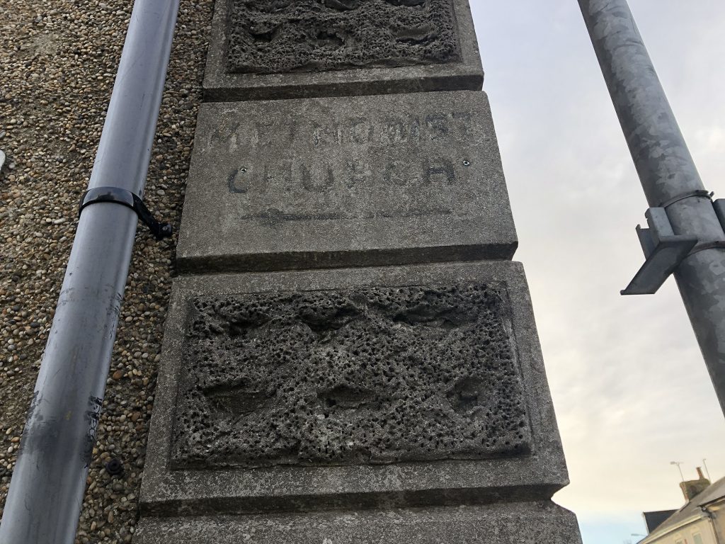
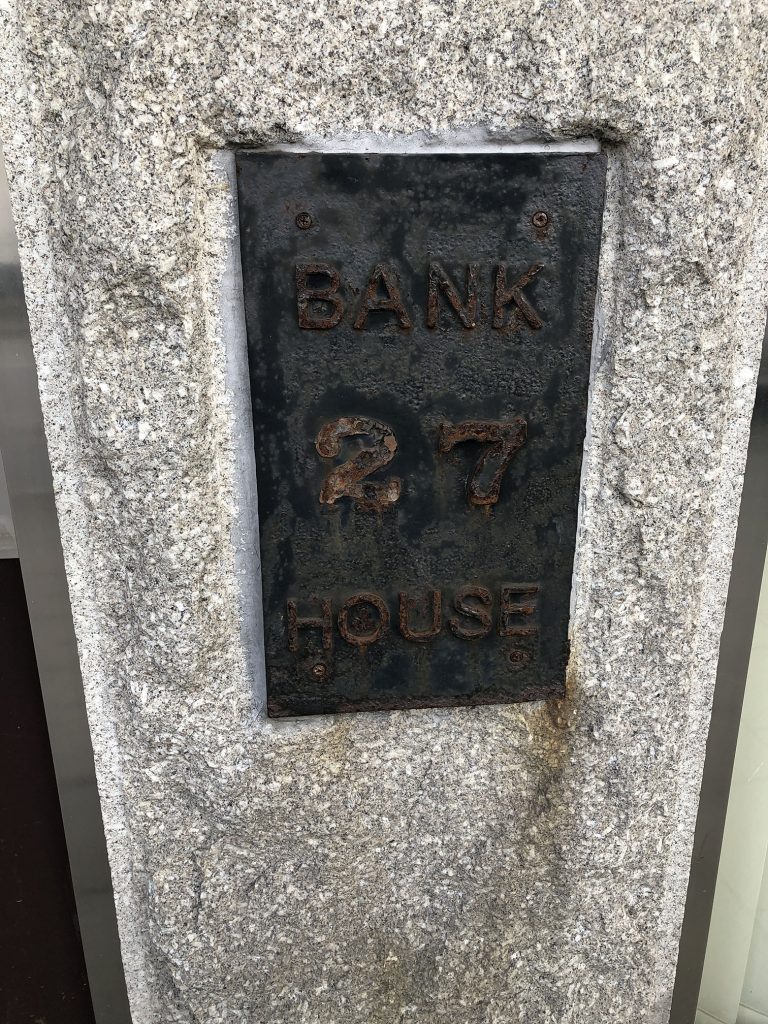
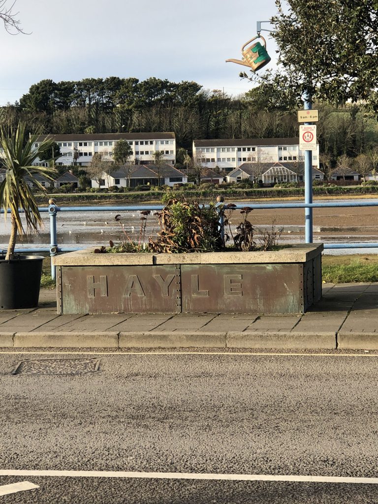
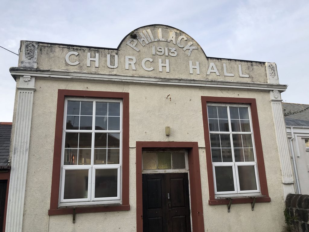
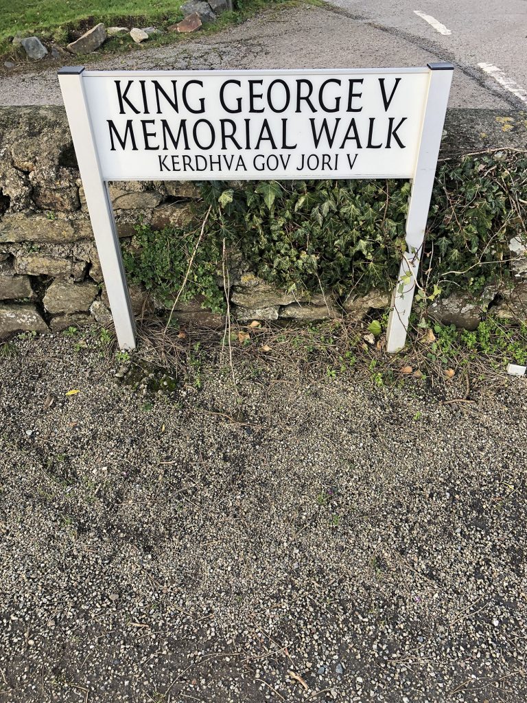
Typography is such a pervasive presence that it is easy to ignore. It is always worthwhile to slow down and pay attention to what is around you, and I’ve enjoyed wandering around my small town looking for interesting type and signage and looking into the history of the town this week. I feel that typography has had an explosion in recent decades. Traditional type was a resource that needed to be purchased at expense from a type foundry, and print shops would be restricted to the typefaces and fonts they had at hand. Hand lettering and signage were very important and allowed for greater creativity along with new methods of reproduction.
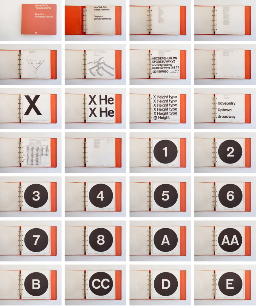
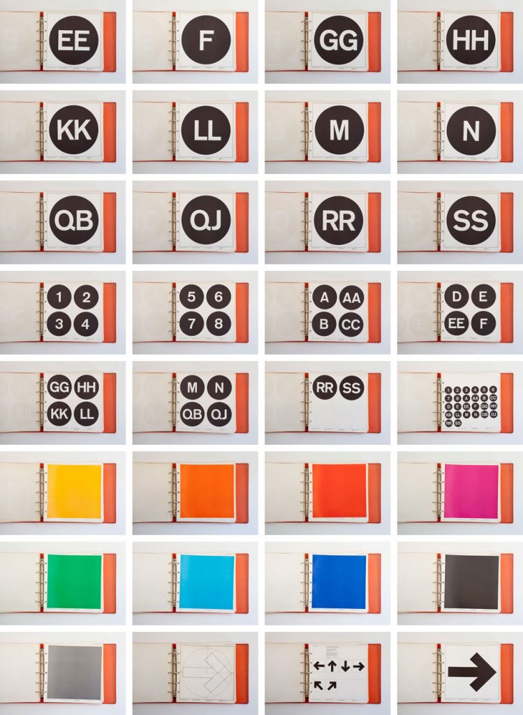
From the lecture I found the history of the New York Transit signage to be fascinating (Tolley 2021). Different styles of typography communicate in different ways, and the biggest challenge of graphic design is to find the combination of type, colour, image and form to correctly communicate your intentions. The impact typography can have on the feel and identity of a specific place in a powerful unconscious way can’t be understated.
I do feel at times a specific typeface choice is less important than implementing it consistently and appropriately to develop a visual language. As a designer who often works with small but established brands, it is so incredibly useful to have proper branding documentation. An end point client almost never knows anything about the company branding or where to locate proper logos or assets. If I do enough work with a specific company I build up my own library of appropriate assets and make note of any branding guidelines I can, so having an entire manual of graphic standards is an amazing resource. The manual itself is striking and a beautiful document that proves that consistency and repetition can go a long way to organising chaos.
Further research
During this week I have also looked into designing typefaces – digital type design has allowed a huge number of people to design and distribute typefaces, and more are released constantly. Season two of the Netflix series Abstract features Jonathan Hoefler and his team as they develop two typefaces, and it was inspiring to watch them working. They collect a huge amount of references, taking photos of signage and old watches, as well as a library of specimen books. Their typefaces can take years to develop, as they are incredibly well thought out and meticulous. If a proper typeface takes years, what could I make in a morning with no experience? I drew a very quick and messy handwritten alphabet in Illustrator and looked into my options.
I started with Font Forge. Font Forge is a free open source type design tool. It seems to be very robust, but I did not find it easy to use. I had trouble using the drafting tools and when I imported svg files from Illustrator I was unable to move or scale them easily.
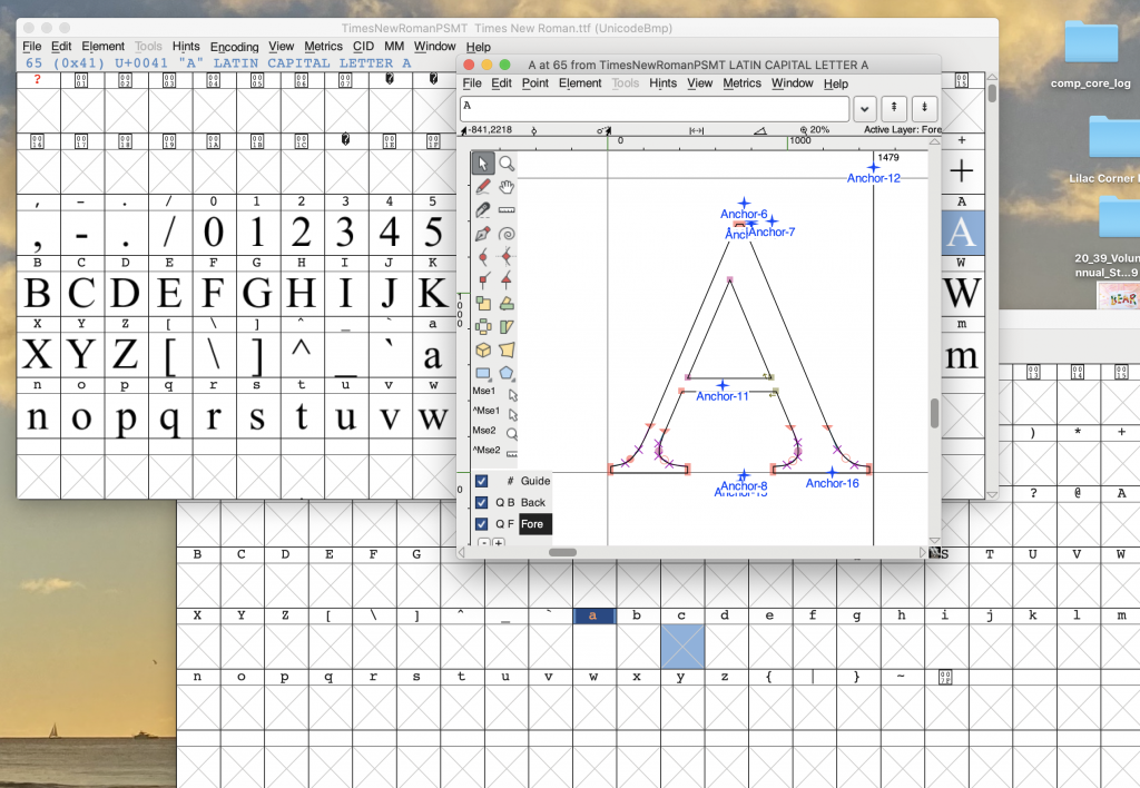
I was able to make a terrible font with it fairly quickly, but I found it quite difficult to use, and could not work out the issues with the space boxes or adjust the kerning.

Next I tried Glyphs Mini. Glyphs is powerful professional software, but I thought I’d try out the Mini option as I am a more casual user.
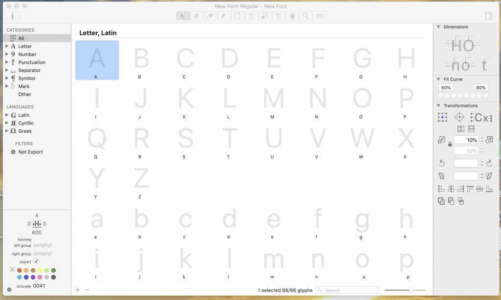
Using the same letterforms, Glyphs was much more intuitive and easy to use for me. I was able to directly copy and paste from Illustrator and then manipulate and tweak the letterforms in Glyphs. The resulting font still has many issues, but I felt much more in control of what I was doing with it. The difference is immediate:

Fontself, an Illustrator plug-in, also piqued my interest. It does not offer a free trial, so I did not try it, but it is not expensive so may be worth further research.
Handlettering has never been a strong point of mine, so I haven’t considered typeface design very seriously. Glyphs Mini was easy to use and I think has a lot of potential, with something better thought out than the quick letterforms I was experimenting with.
Workshop Challenge
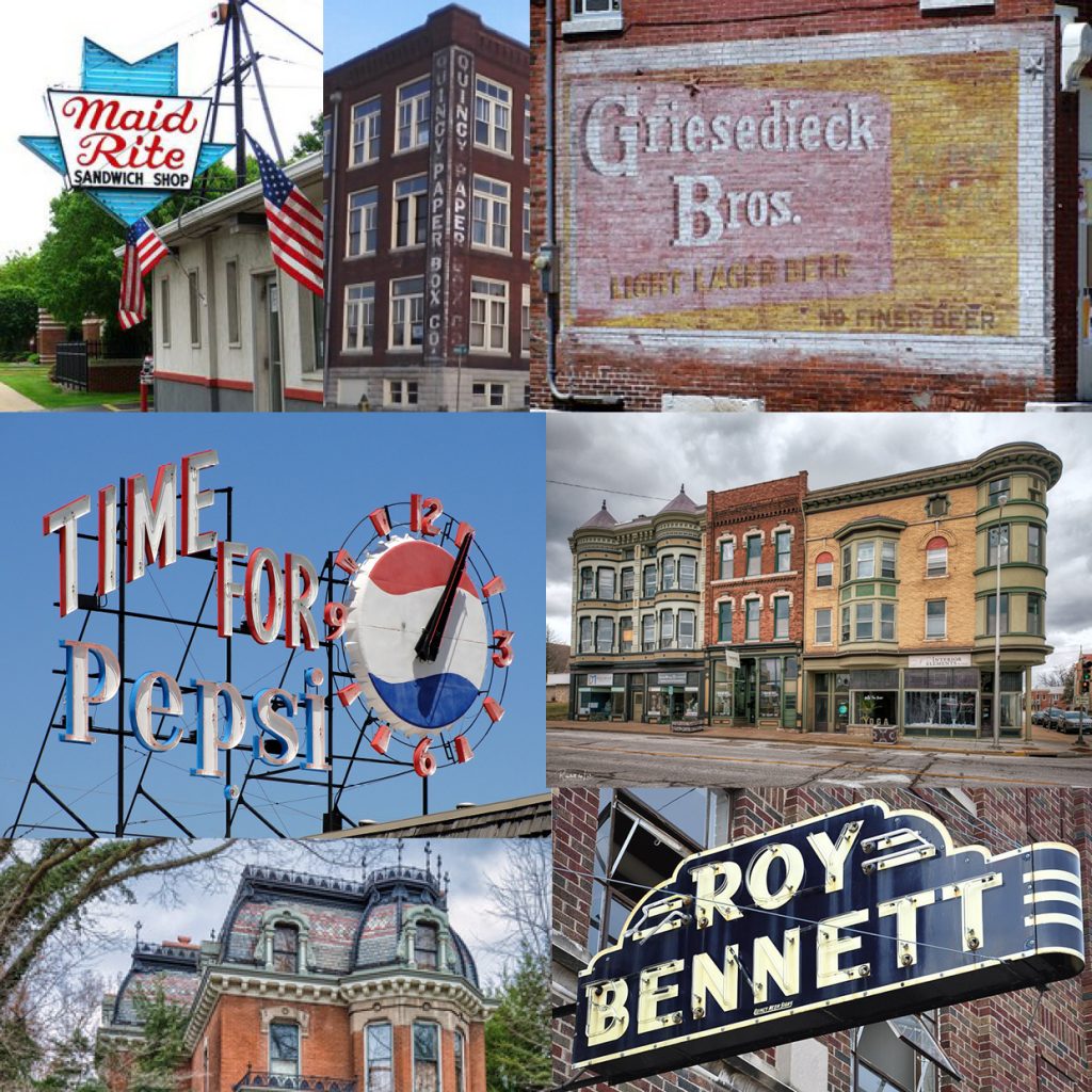
Edward Fella’s work was immediately familiar to me. I grew up moving from state to state in America, and spent the longest amount of time in a very small midwestern city called Quincy Illinois. Quincy has a beautiful historic district with interesting architecture, old signage and plenty of red brick ripe for ghosting as referenced in this week’s lecture by Matt Cohen. When I lived there, grocery stores still kept a signwriting department busy, handpainting specials on butcher paper taped to the windows. I found some examples from my childhood town, including ghosted brick, vintage neon, and the iconic “Time for Pepsi” clock on the top of the bottling plant.
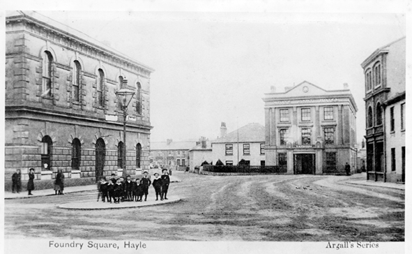
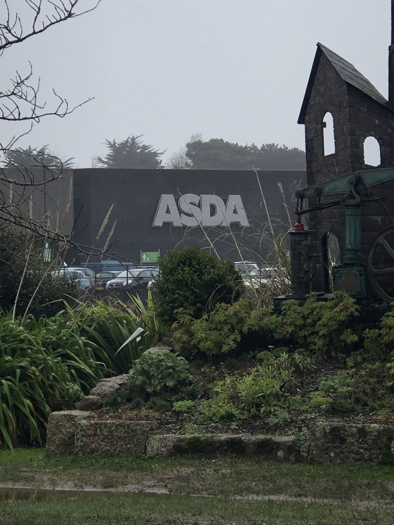
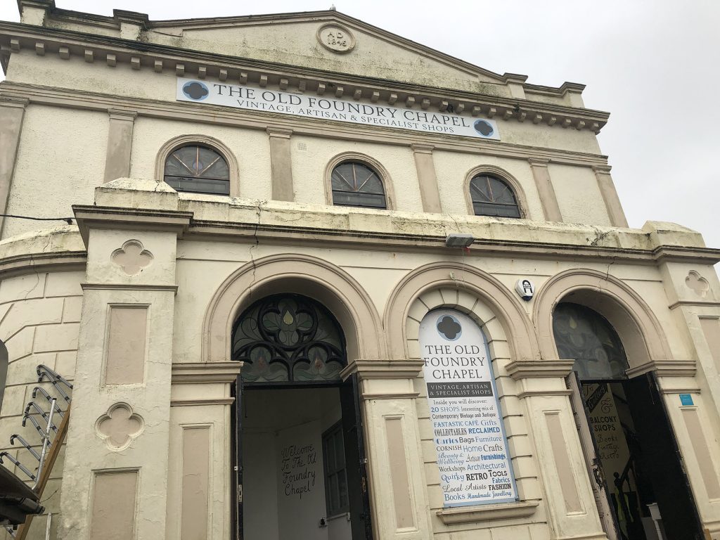
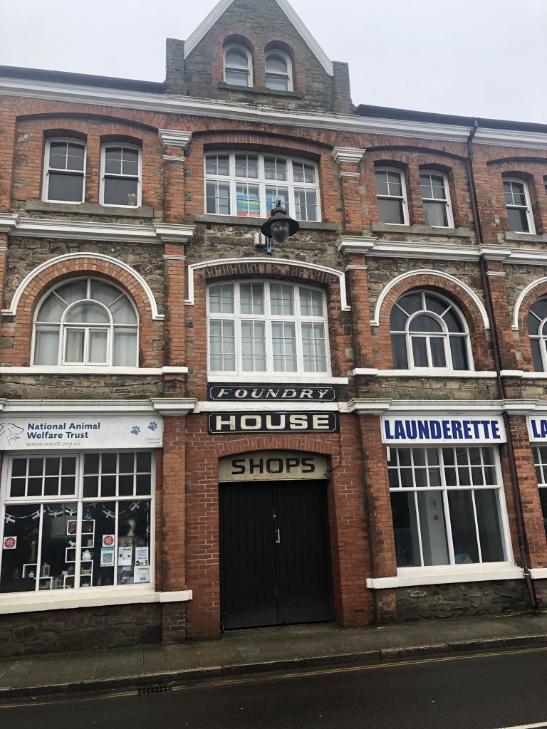
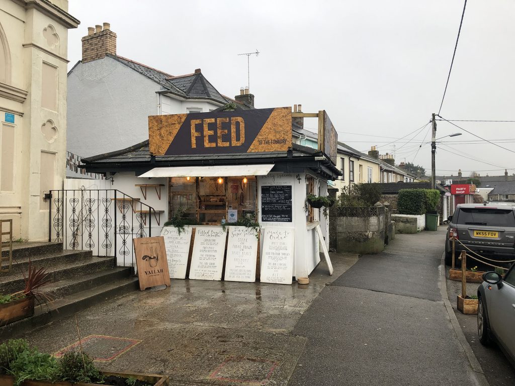
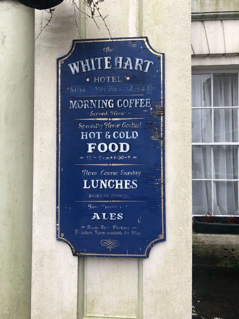
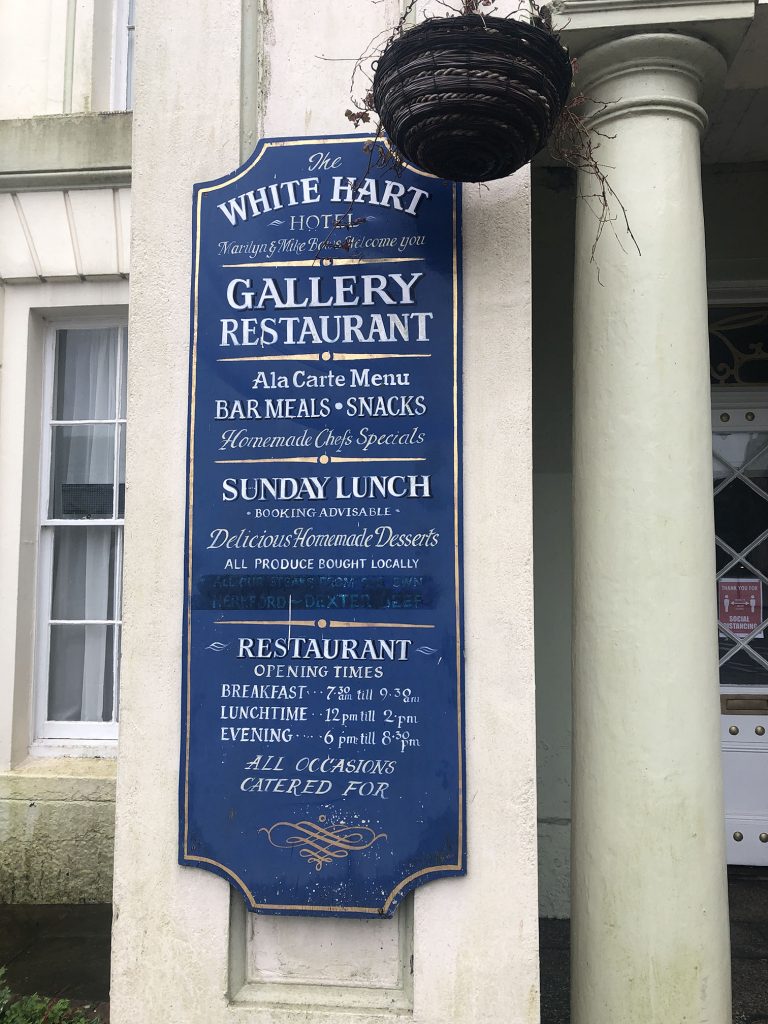
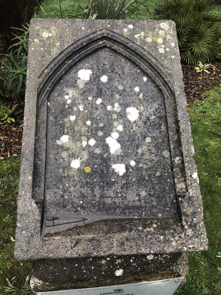
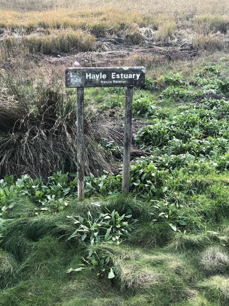
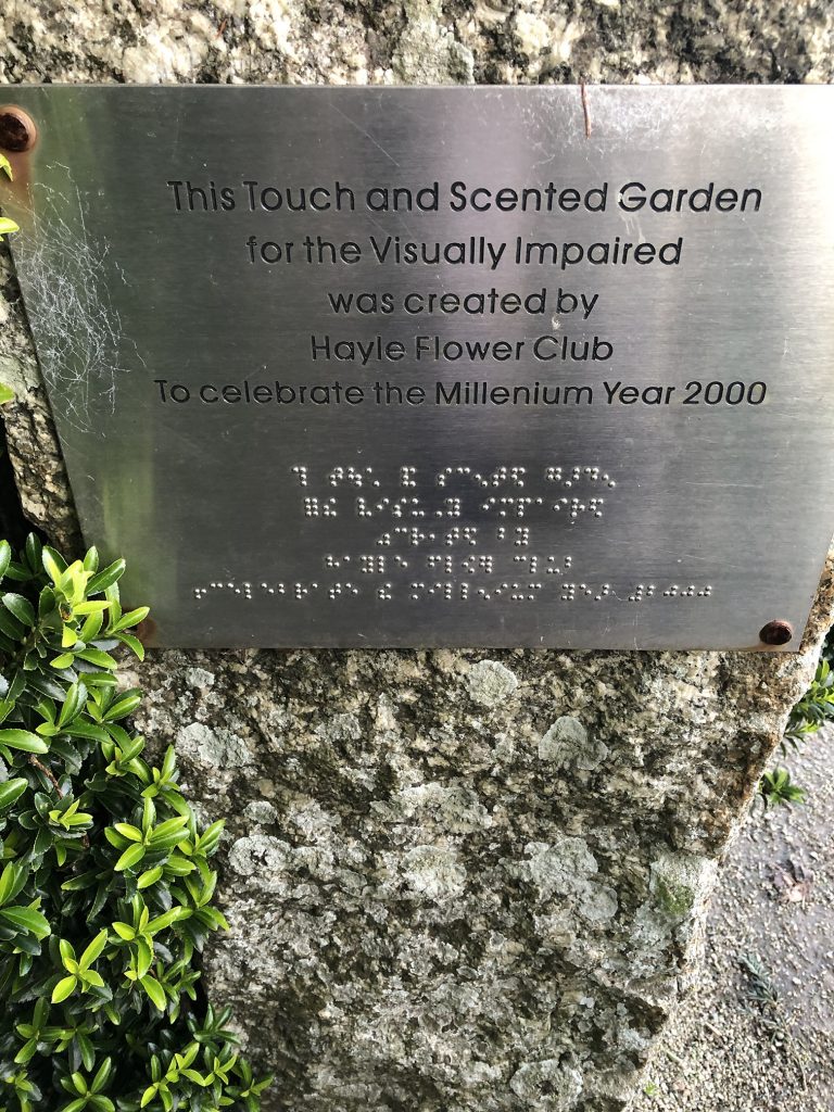
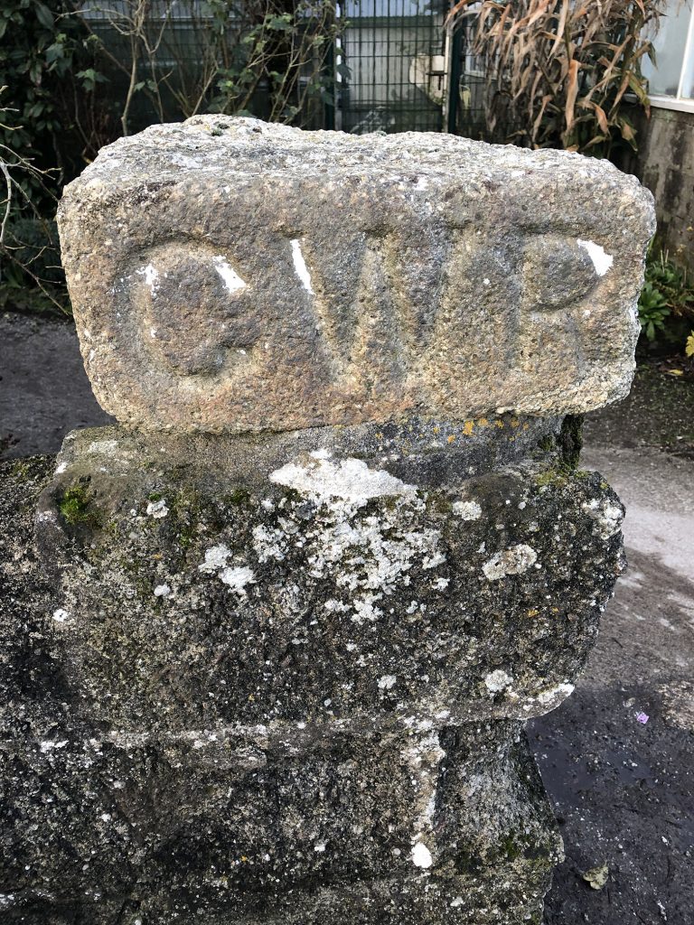
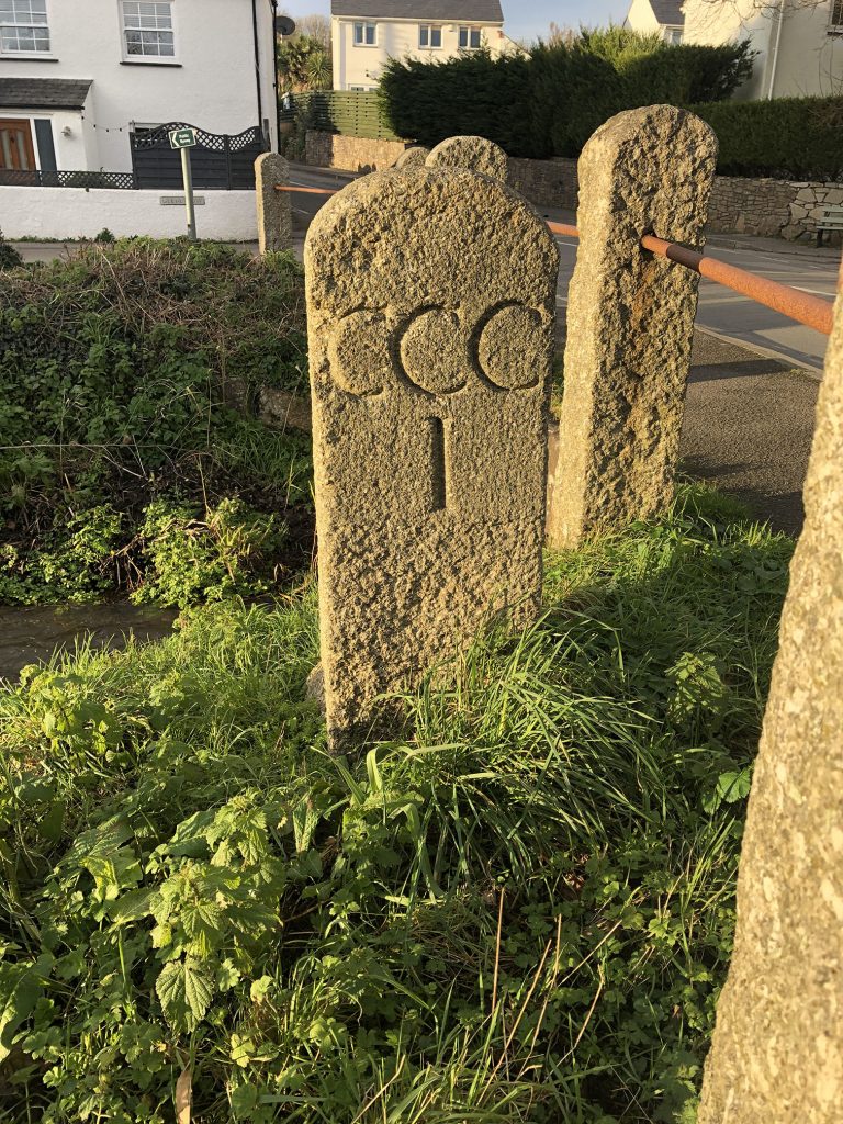
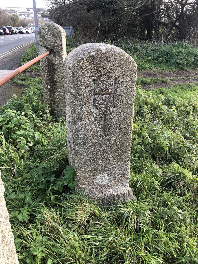
These feel very different to the photos I took this week of the small town by the sea in Cornwall where I’ve lived for the past 13 years. Hayle was essentially split in two by rival companies, the Cornish Copper Company, and Harvey’s Foundry. Even today there is still a boundary stone demarcating the territory of each company, and the town grew in tandem. The rivalry was so intense that it eventually led to a “war” that had to be broken up by the military with a peace treaty drawn up by the company owners. As a result, Hayle now has three distinct sections, Copperhouse, Foundry and Tourism.
Boundary Stone
Carnsew Gallery
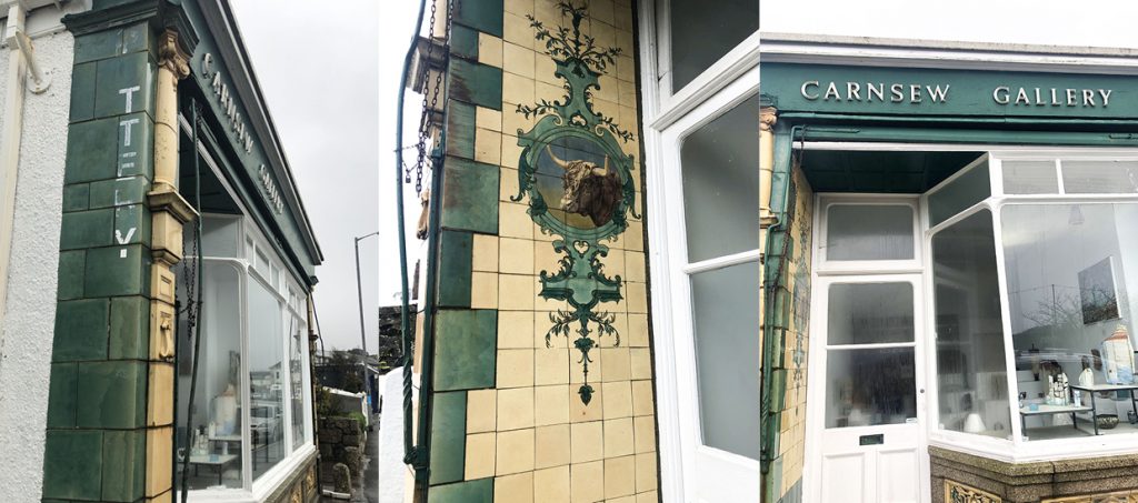
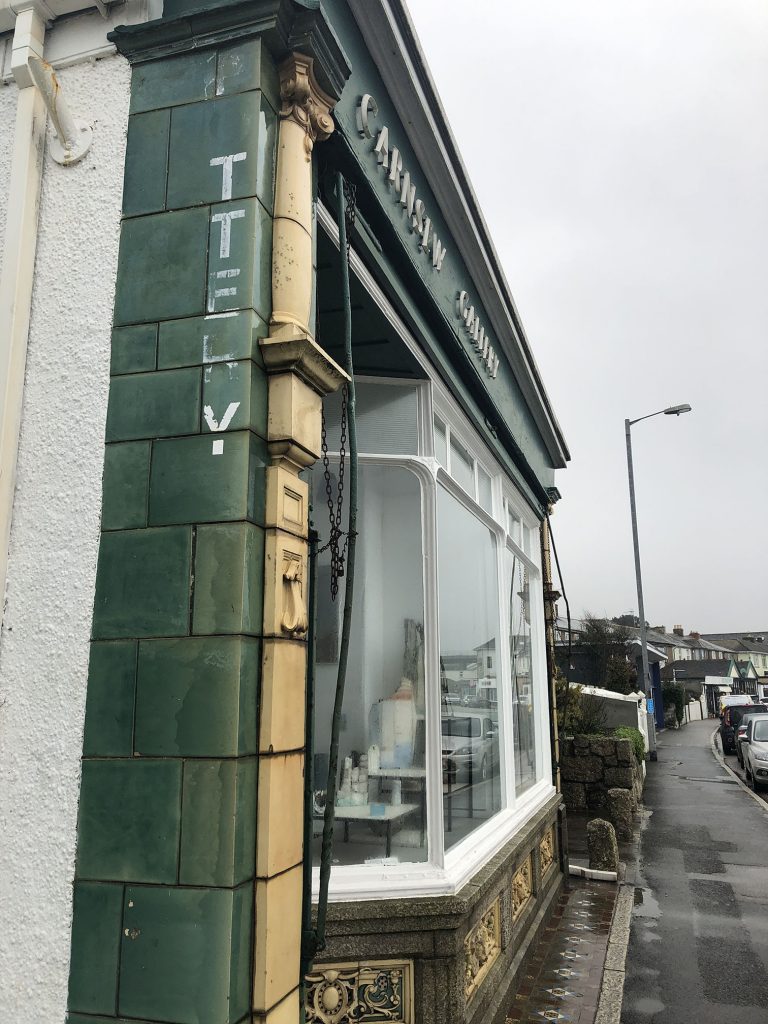
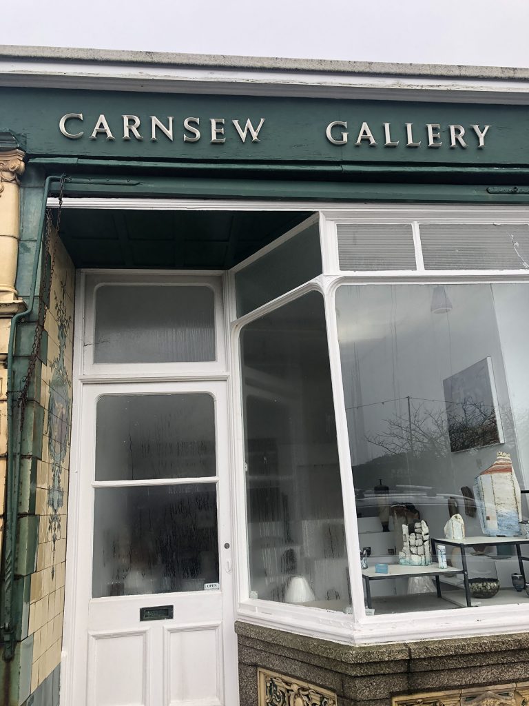
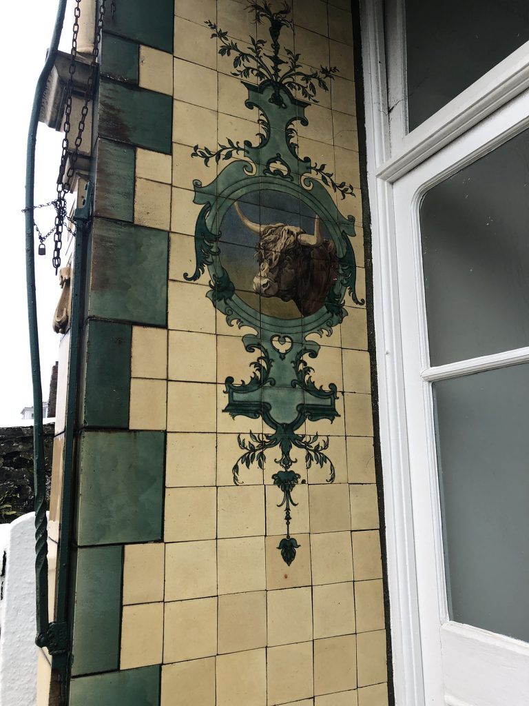
Hayle was a “company town” and in Foundry that meant workers were only allowed to shop at the company store and independent shops were banned. As no shops were built on that side of town, when the policy ended there was no available space to build them. The result is Foundry’s “Garden Shops” on Penpol Terrace- shops built into front gardens and jutting out from the homes behind them. One of these is Carnsew Gallery. Originally a butcher shop, it has an incredibly decorated facade. It features painted tiles and sculpted decorative lambs heads as well as a fantastic cow themed feature wall next to the entrance. It now houses a ceramics gallery, with lightly serifed relief lettering along the shop front. Down the side of the gallery are some hand painted serif letters reading “POTTERY” which have faded and worn.
Philps
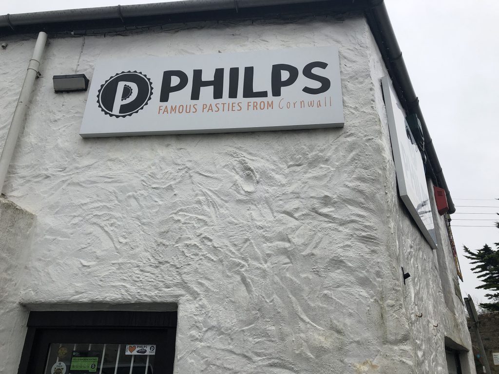
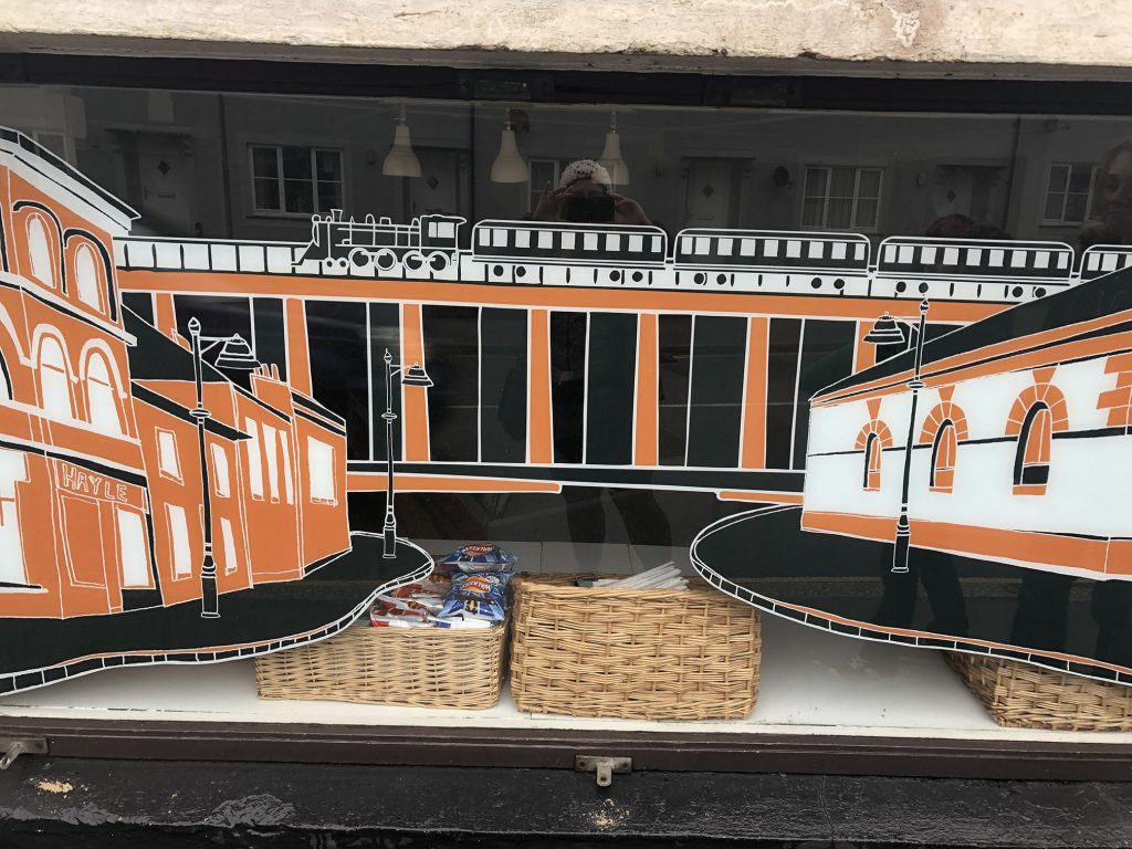
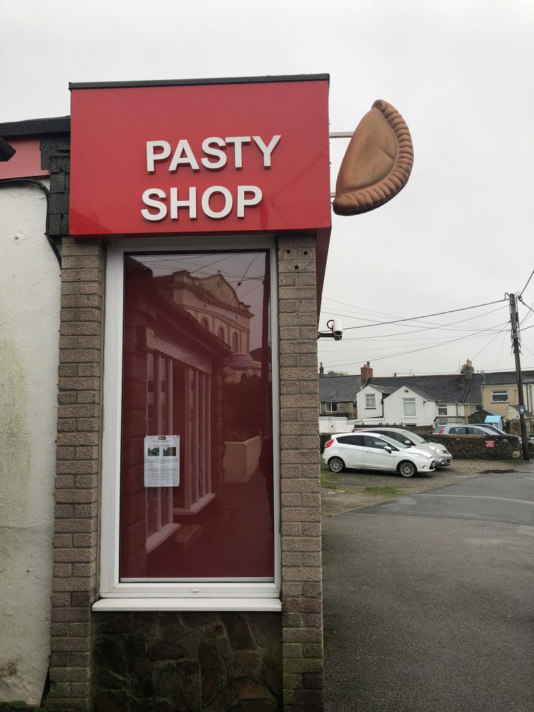
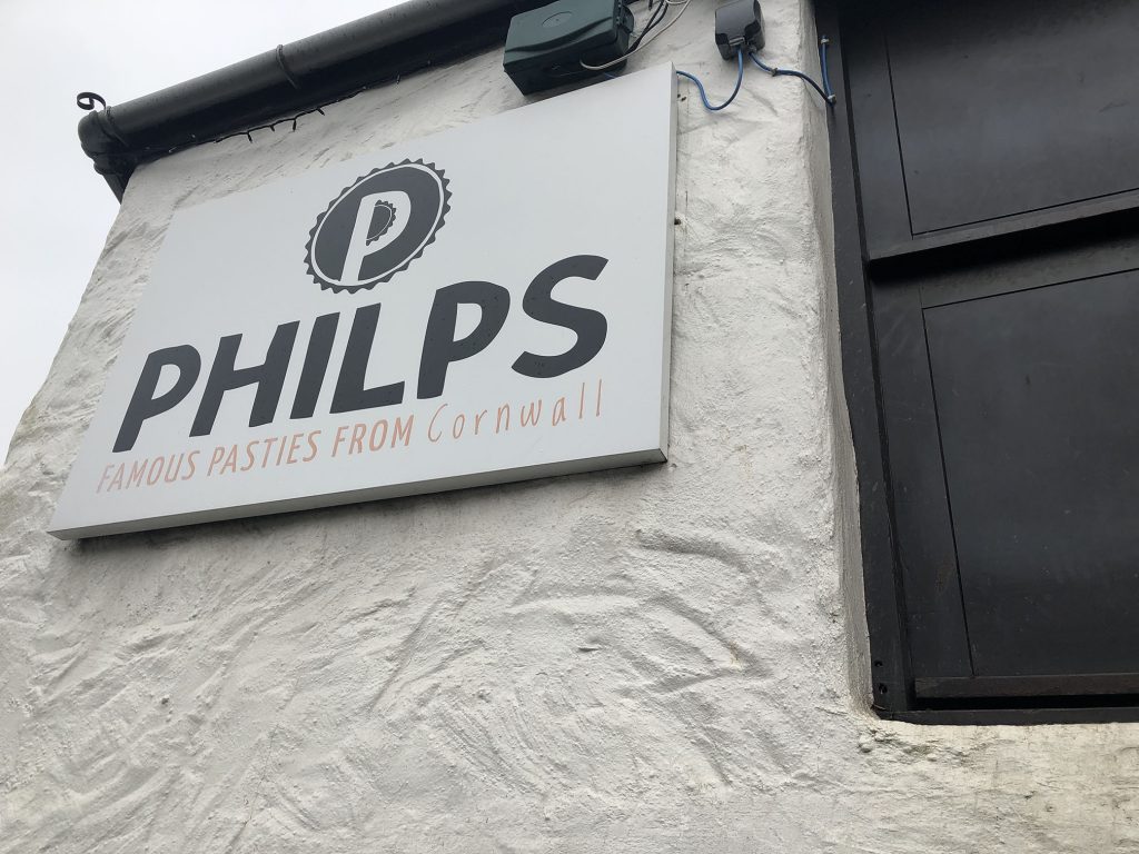
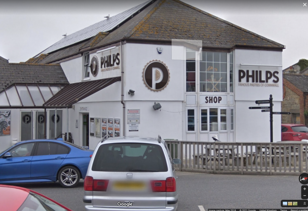
Pasties are serious business in Cornwall, and although Hayle is small, it boasts six pasty shops. Philps is one of the best pasty shops in Cornwall and was founded in Hayle. They have two shops in town and were rebranded a few years ago by Rose Robinson. Rose uses bold hand written typography she designs herself, using using a variety of techniques such as paper cuts, printmaking and illustrations in a bold graphic style. The Philps signs have been updated and the window in the Foundry shop features a stylised illustration of the direct area around it, including the viaduct.

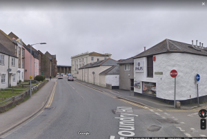
Google maps 2019
The signs themselves are very new and slick with matching signage at the East Quay location. I could not get close enough to tell the exact makeup of the signs, but I did note that the lovely handmade noise of the logo is missing from the plastic cut letterforms mounted on the side of the building at East Quay. This is the tradeoff when having signage produced using cutting machines. The crimping on the brandmark is very effective on the cut signage and they have retained the iconic moulded pasty sign in the forecourt whilst updating the typeface and colouring.
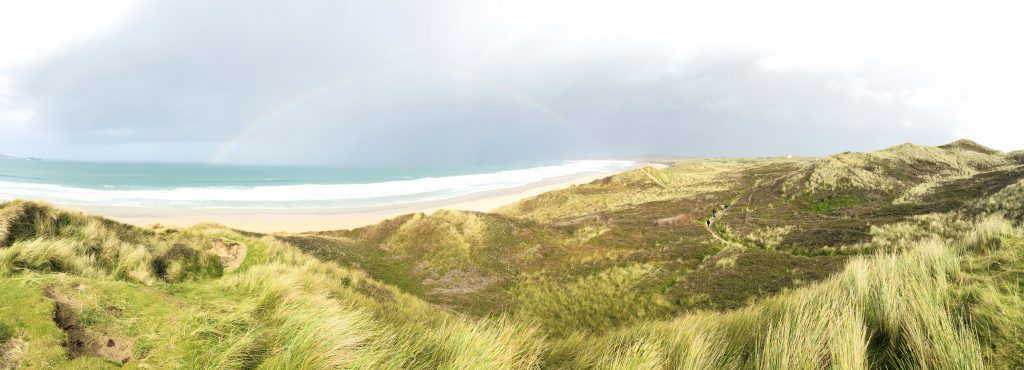
Sandy Acres Beach
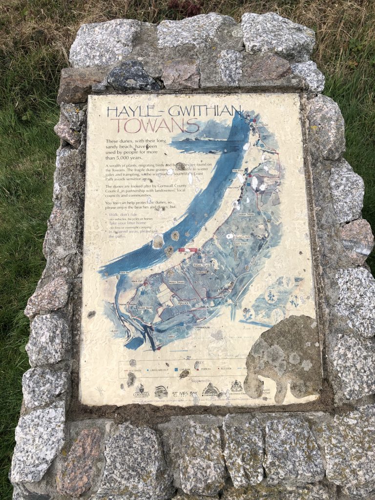
At the top of the dunes at Sandy Acres is this informative plaque, cemented into a stone cairn. I have been unable to find the original artist, but it features some lovely hand painted watercolour lettering along with the map of the Towans. The lettering is delicate, and looks as if it has been painted with a small angled brush. Portions of the “N” and “S” are transparent and overlap an illustration of Godrevy Lighthouse, and I am especially interested in the elongated bottom of the “E”. The plaque is mounted on stone, and where it has worn away lichens have started to grow. The colours and and details have faded and worn, but it is still a point of interest. Children climb on it, surfers drape wetsuits over it and it overlooks the sweep of the bay all the way to St Ives.
Tourism – The Towans
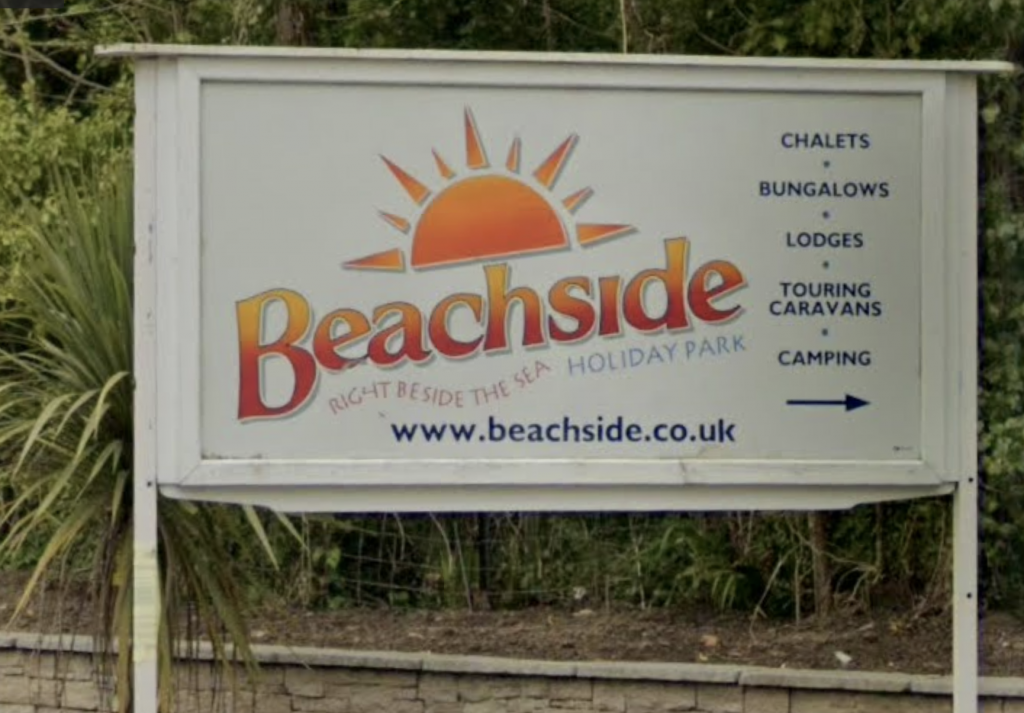
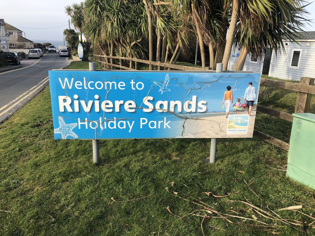
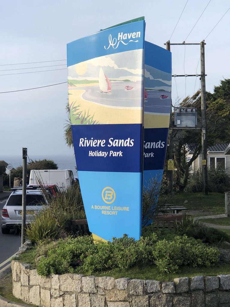
With the loss of commercial industry in Hayle, it began trading on its 3 miles of golden sands. Holiday parks sprung up all along the coast, with chalets, bungalows and camping opportunities all along the sand dunes. These feel separated from the rest of town, with hordes of tourists descending on the local grocery stores and ambling down from the dunes to visit the shops and restaurants. Hayle now depends greatly on the seasonal influx from holiday parks such as Beachside. The old sign feels tired and dated, with a jumble of type and effects. The main logotype includes a jaunty gradient, dropshadows, white outlines and a tagline typed on wavy path shoehorned in between the logo and web address.
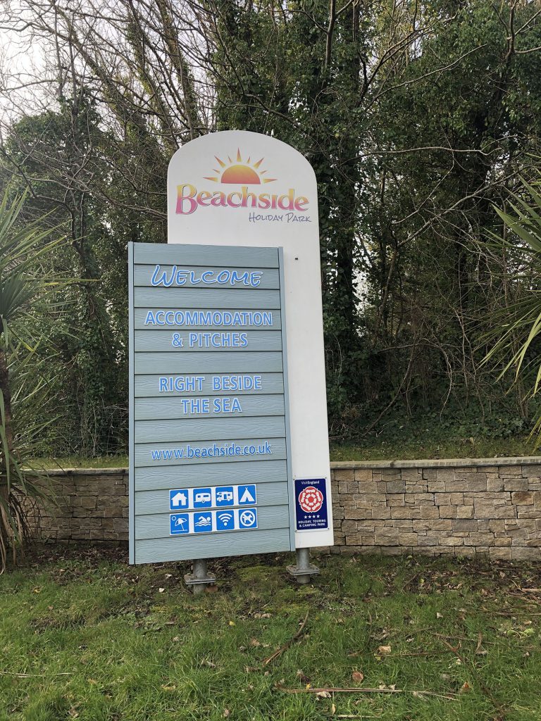
The updated sign is much more contemporary, although it retains the gradients, drop shadows and white outlines. The entire logo has been straightened and refined, with a new smallcap font for “Holiday Park” which is repeated in the “Welcome” below. It seems quite common for logos to forgo a tittle on a lowercase “i”, which feels uneven to me, but the entire sign is more cohesive. It is also mirrored on the other side of the road, flanking the entrance to the holiday park.
Reflections
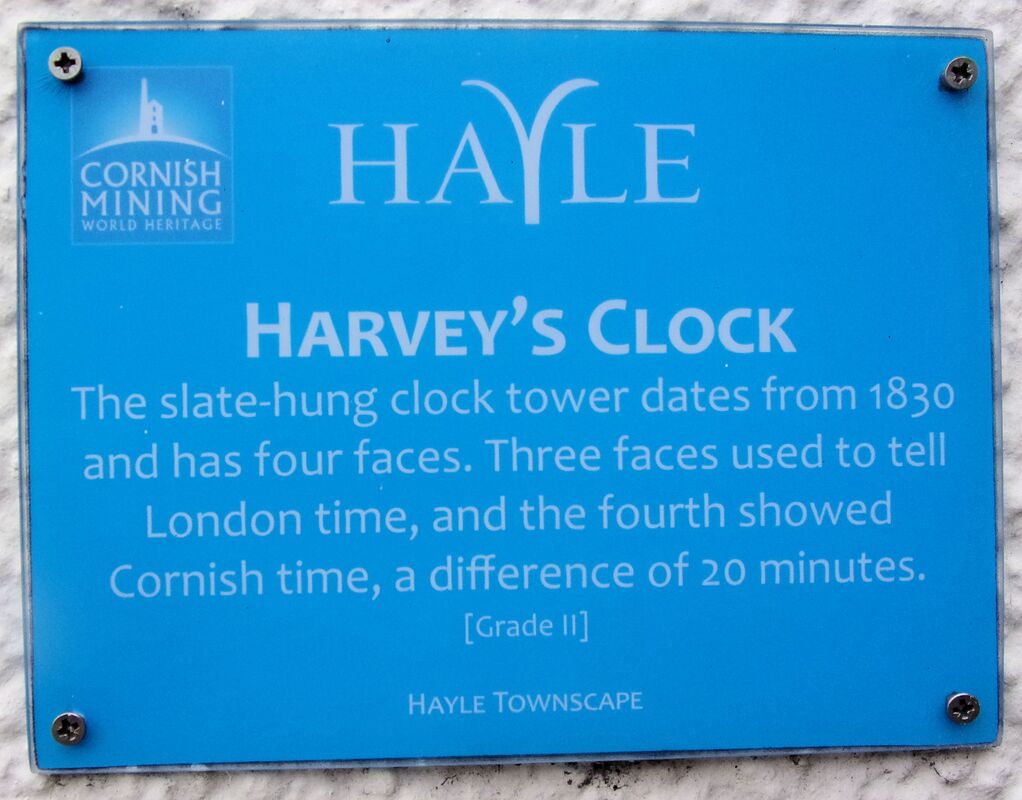
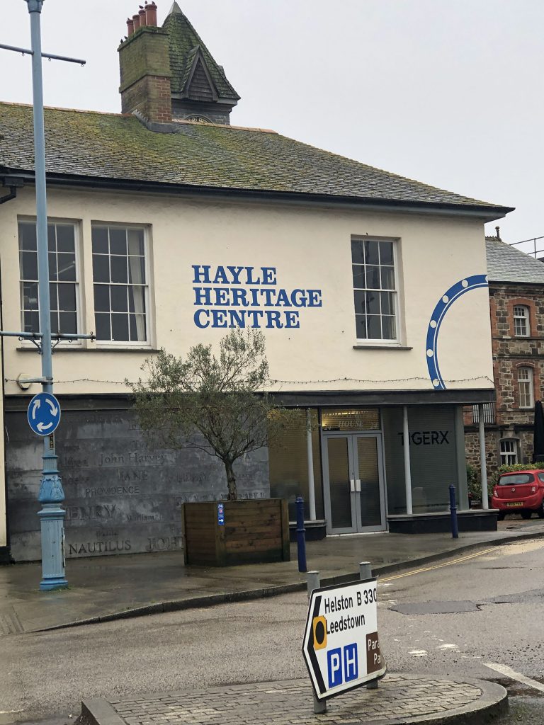
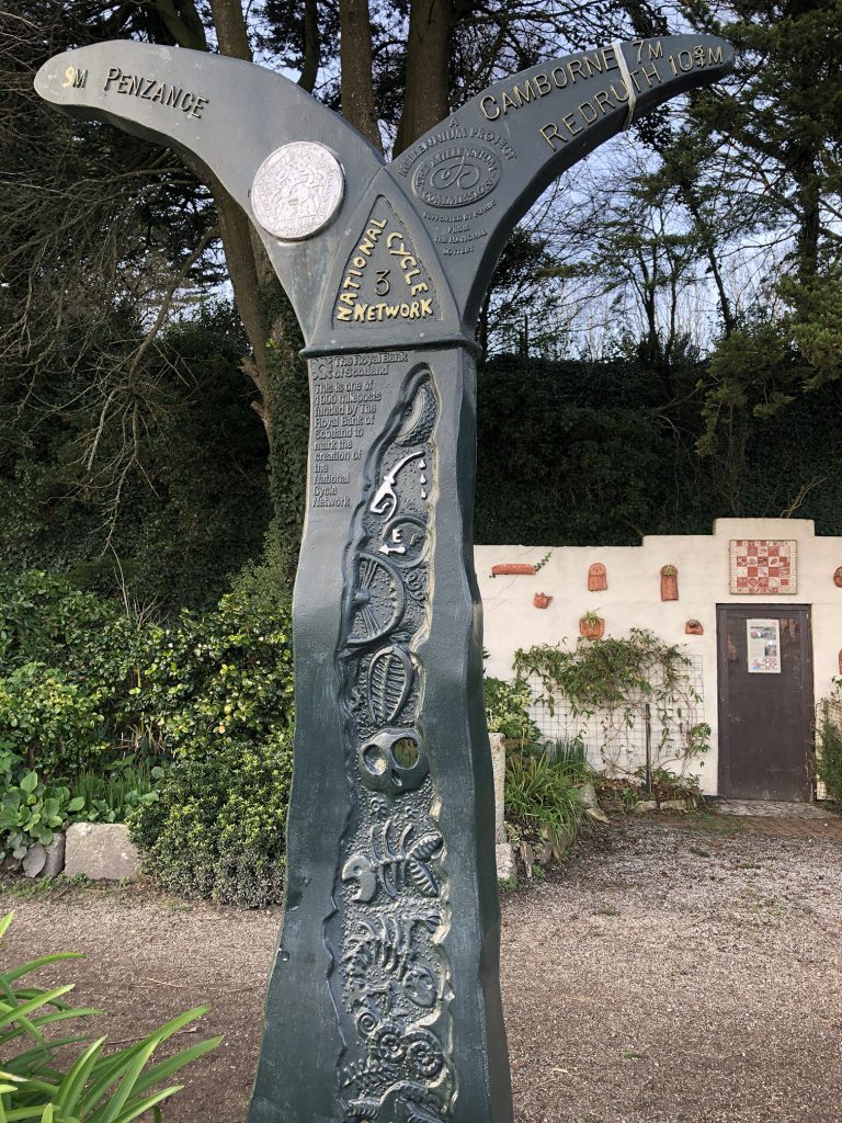
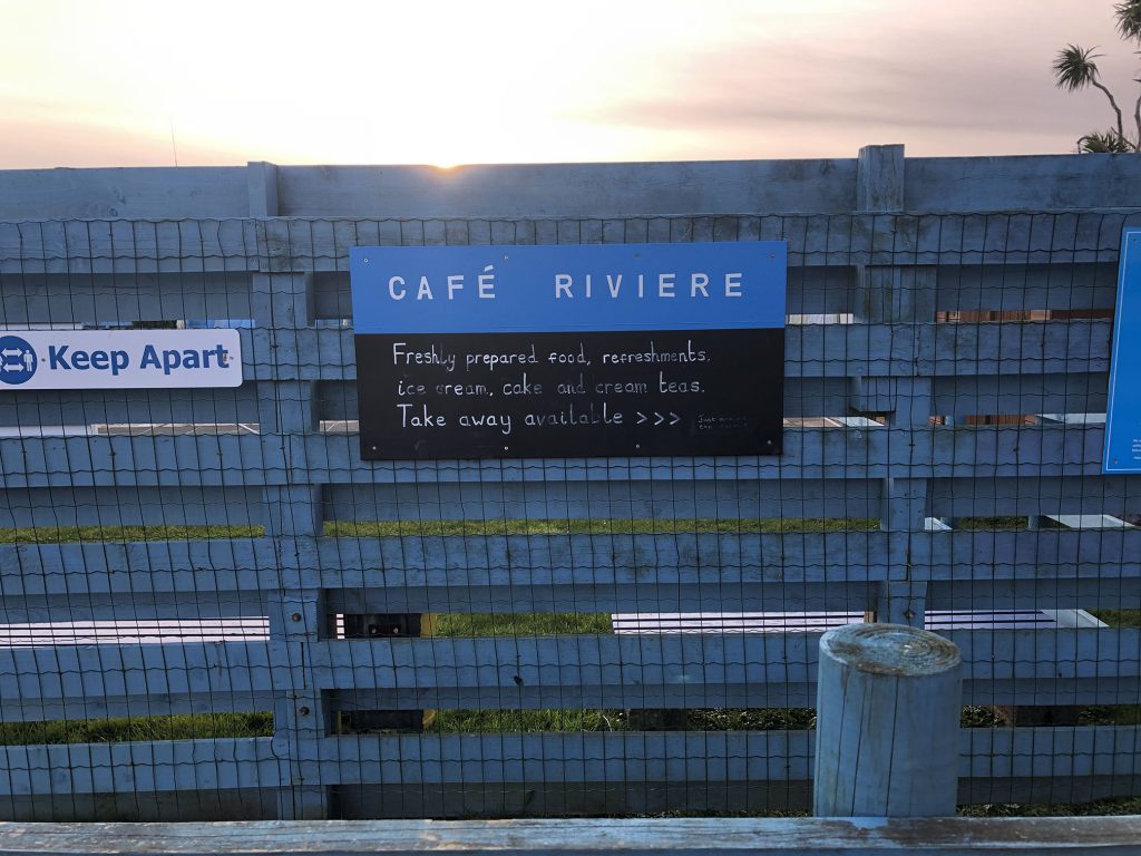
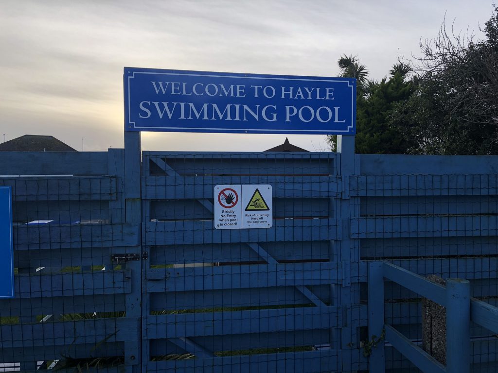
Hayle is a small town with a sporadic attempt at branding and inconsistent signage. A few years ago they developed a cyan and white logo, featuring a broad and fluid “Y” flanked by more traditional serifed lettering. This has been used throughout town on historical plaques and community information, but hasn’t spread beyond this. The community is very aware of and proud of its history and takes efforts to preserve and promote the heritage of Hayle. There are with historical walking guides available and the Hayle Heritage Centre operated by Harvey’s Foundry Trust. I’ve done a quite a bit of work for the Heritage Centre, so it was interesting to look at the information through a different lens.
References
BAINES, Phil and Catherine DIXON. 2008. Signs : Lettering in the Environment. London: Laurence King Pub.
Bentley, Alexander and O’Brian, Michael J. (2017) ‘Chapter 2: Change is not Norman’) in The Acceleration of Cultural Change (Links to an external site.), (Cambridge, Mass: MIT Press)
“Flickr.” 2021a. Flickr [online]. Available at: https://www.flickr.com/photos/34086110@N06/4679490430/in/photostream/ [accessed 29 Jan 2021].
“Flickr.” 2021b. Flickr [online]. Available at: https://www.flickr.com/photos/myoldpostcards/49967515386/ [accessed 29 Jan 2021].
Hustwit, Gary (2015) ‘A Rare Interview with Graphic Design Legend Massimo Vignelli (Links to an external site.)’, Fast Company, 24 March [online]. (Accessed: 23 January 2021)
“Illinois Signs | RoadsideArchitecture.com.” 2015. Roadarch.com [online]. Available at: https://www.roadarch.com/signs/il7.html [accessed 29 Jan 2021].
“Importing from Illustrator into Glyphs Mini | Glyphs.” 2020. Glyphs [online]. Available at: https://glyphsapp.com/learn/importing-from-illustrator-into-glyphs-mini [accessed 28 Jan 2021].
“Quincy Paper Box Co – Quincy IL Image.” 2021. Waymarking.com [online]. Available at: https://www.waymarking.com/gallery/image.aspx?f=1&guid=59db91fd-3760-4650-a0e2-f0ee4d1098c7 [accessed 29 Jan 2021].
RYAN, Keith. 2021. “The Cornish Pasty: Hayle – the Pasty Capital of the World.” Cornishpasties.org.uk [online]. Available at: http://www.cornishpasties.org.uk/hayle-pasty.htm [accessed 28 Jan 2021].
“Software for Type Designers.” 2015. Fontsmith.com [online]. Available at: https://www.fontsmith.com/blog/2017/10/25/an-introduction-to-software-for-type-design [accessed 28 Jan 2021].
WILD, Lorraine and Lewis BLACKWELL. 2000. Edward Fella : Letters on America : Photographs and Lettering. London: Laurence King.
