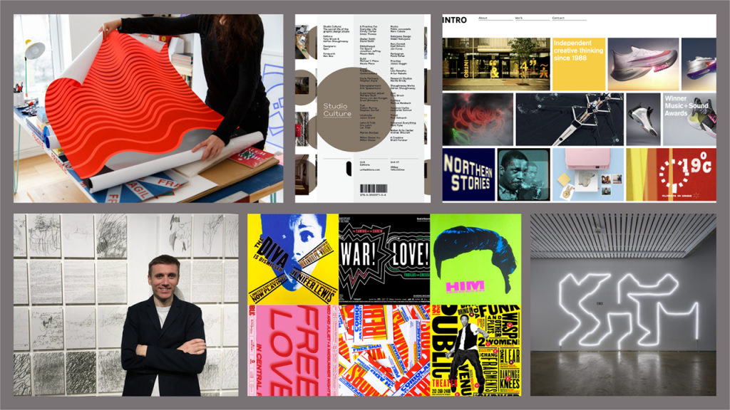
Where Are You and Why Design? This initiative examines the subject of graphic design, it’s boundaries and genres in relation to personal, regional and global perspectives.
In what way does the culture of a studio affect the work? This lecture was an interesting exploration of a variety of practitioners who all work in quite different ways.
Collective/Co-op
Single Practitioner
Partnership
Authorial Practice
Agency
I also read Studio Culture – Tony Brook; Adrian Shaughnessy, Communication Design: Insights from the Creative Industries – Derek Yates; Jessie Price, watched Intel Visual Life – Michael Wolff and Abstract – The Art of Design Season 1 Episode 6- Paula Scher – Graphic Design
Intro Design, is a collective studio in London. Julian House and Adrian Talbot spoke about their work and background. They both had very different skillsets and do not usually collaborate, instead working within their own niches. How do you manage several different workstreams without collaboration and have a cohesive practice? The answer seems to be a talented managing director who can pull things together. Working side by side but not together is a familiar work pattern to me. I normally work in an office in the mornings, and then work from home in the afternoons and evenings. Transitioning to only home working during a global pandemic has been isolating. I’m used to being able to bounce ideas off of studio mates even if we aren’t working together, and to have a general sense of all of the projects underway. How can I improve this environment?
Regular Practice is a relatively new partnership between Kristoffer Soelling and Tom Finn. It was refreshing to hear them speak about mistakes they made setting up their business – bringing work in is a daunting enough task as a freelancer or new studio, but not realising the importance of the business side of things is a danger that is easily overlooked. This is definitely not one of my strengths, and something we will hopefully be covering in later modules.
Sam Winston touched on concepts I’ve been struggling with as well. How do you define yourself? What do you want to do? His story about realising how huge the publishing industry was and eventually concluding that he was looking for the wrong thing really resonated. He did not want to be employed, he wanted to create and began thinking of himself as a free agent. This is a distinction that makes me very uncomfortable, can employment and creative expression be combined? Is that down to luck of the draw or will certain studio environments nurture and support you in that way?
Intel Visual Life – Michael Wolff
I was struck by how little of Michael Wolff’s work was featured in this short – but on how curated his life is. He makes very considered choices in how he presents himself, down to coordinating his shirt and umbrella! He sparked a lot of questions about creativity and idea, that visual curiosity and appreciation lead to imagination, and that these are things that can be practiced and strengthened.
I have three muscles, without which I couldn’t do my work. The first is curiosity. (You can call it inquisitiveness, you can call it questioning.) The second muscle [is] the muscle of appreciation. It’s not questioning so much as it is noticing… how joyful things can be, how colorful things can be, what already exists as an inspiration. The muscle of curiosity and the muscle of appreciation enable the muscle of imagination. – Michael Wolff
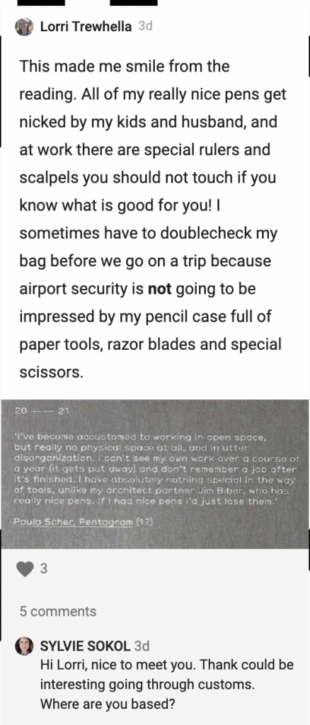
Paula Scher had similar things to say about design and where it comes from. I posted this snippet from Studio Culture on the Idea Wall this week – it is hard to read her quote so I’ll transcribe it: “I’ve become accustomed to working in open space, but really no physical space at all, and in utter disorganisation. I can’t see my own work over a course of a year (it gets put away) and don’t remember a job after it’s finished. I have absolutely nothing special in the way of tools, unlike my architect partner Jim Biber, who has really nice pens. If I had nice pens I’d just lose them.” Paula Scher, Pentagram
Watching the Abstract episode about her after reading this quote made me take note of her archive. The size of the room and the number of boxes was staggering. Not only has Paula produced such a large body of work, she’s saved it. Her career also spans the digital divide, which is something I find very interesting. How do you adapt when everything changes so drastically? I focus mostly on print design at the moment, but I’m seeing far more opportunities available for digital design.
This led me to this article from 2016 on Design Week.
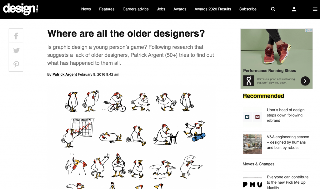
Patrick Argent found that “Some older designers who, having been both trained in and subsequently practiced using traditional, hands-on craft techniques, would have found that much like the late great John Gorham, the transition to digital tools was a task too difficult or too complex for them to essentially overcome.
Gorham found it difficult to accept that his once-trusted methods and finely-honed craft skills had been suddenly rendered obsolete by the new technology.”
In spite of this, many designers made the transition and continue to work. Some may have transitioned to more senior roles, into management or mentorship. The continued pace of technological advancement brings significant challenges. Software is constantly updating, the capabilities of display and how we interact with technology continue to evolve.
It is not necessary to be skilled in all aspects of design and technology, the sheer scope of the industry would make that impossible, so collaboration becomes crucial. Sharing your ideas and skills and working with others is key to being an adaptable and effective designer.
Workshop Challenge
Who are you? (Name, background, influences, what makes you you?)
Where are you? (geographically and does this have an impact on how you work?)
What is it that you do? (Showcase a pivotal project or moment in your practice)
Why Design? (What does design mean to you? What does it do?)
This week’s workshop challenge was to create a quadriptych. This almost felt like a secondary task as I was also wrestling with wordpress to set up a blog. I had a website already, and I’ve spent rather a lot of time trying to incorporate a blog without breaking everything else. This has been a real struggle, but I finally have something that is functional. I can refine the design as I go.
Once I started on the workshop challenge I rushed in quickly and made a first draft which is a good example of my personality and how I work. I had an idea, I executed it quickly and competently and then realised that the tutors were asking for something a bit more simple and less text based. I’m pleased with the layering and illustrations I used, but I needed to refine the work to fit the brief better.
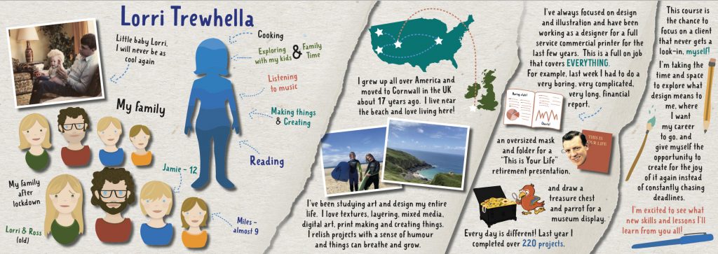
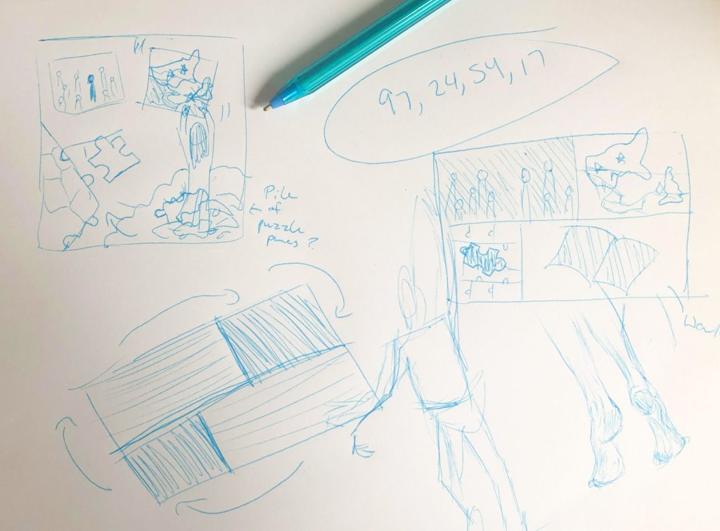
I started over, doing a bit of research and looking at examples. I also took the time to make some thumbnails and plan a bit more. I work quickly, with many iterations – but it can be helpful to strip everything back to the basics and put pen to paper. I always have bits of paper with notes on them, mostly CMYK colour tags, dimensional notes and job numbers. I’ve fallen out of practice of actually sketching and doing thumbnails, which is something I am going to put more emphasis on.

I kept the graphic of the countries, as I thought it represented where I’m from very well. The stars signify different areas I lived in for any major amount of time, and also the journey from place to place, this is layered over a photo taken in Cornwall a few weeks ago. The teal green is one of my favourite colours and also coordinates with the colours in the photo. The self insert represents how I am constantly refining work, reaching up to tweak and straighten. I was not happy with the illustration, my drawing skills have definitely atrophied without use. I also felt the puzzle piece was too simplistic and did not use the space at the bottom to the best of its ability.
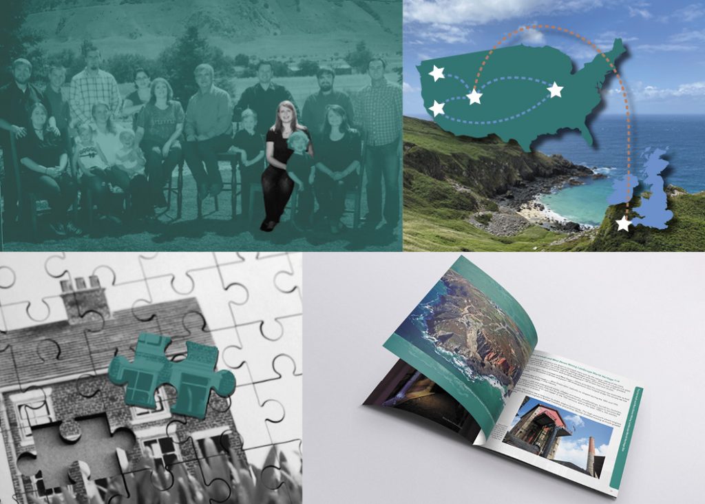
My third draft was further refined. I had resisted using straight edges previously, but decided to embrace them. The first panel is from a family portrait and I used its dimensions to inform the composition. The longer panels followed by shorter panels create a circular movement that draws the eye around the piece. I included a guidebook I created for the Geevor Tin Mine as an example of my work which happened to match the colour scheme very well, and created a new puzzle graphic to replace the hand drawn one. This version is much more slick, but doesn’t have as much of my personality embedded in it.
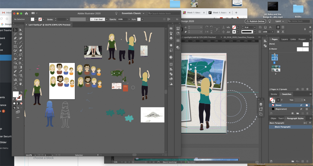
I use references and inspiration directly in my workspace, pulling sections apart, making changes as I go and directly moving between programs.

The first image I used for the puzzle piece did not work well, it was too flat and the white of the pieces looked both too busy and stark in relation to the rest of the quads.
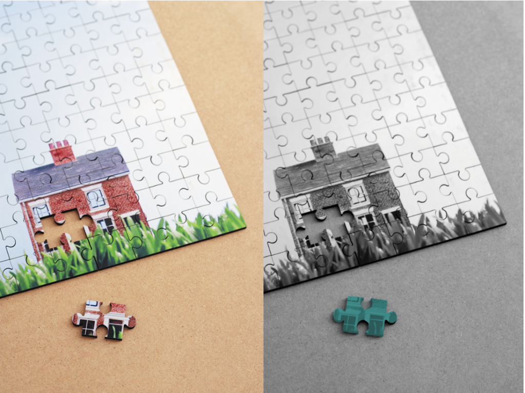
I chose a new puzzle image and edited it to match my design, but when I placed it I discovered that the sharp lines of the edge of the puzzle clashed with the composition.
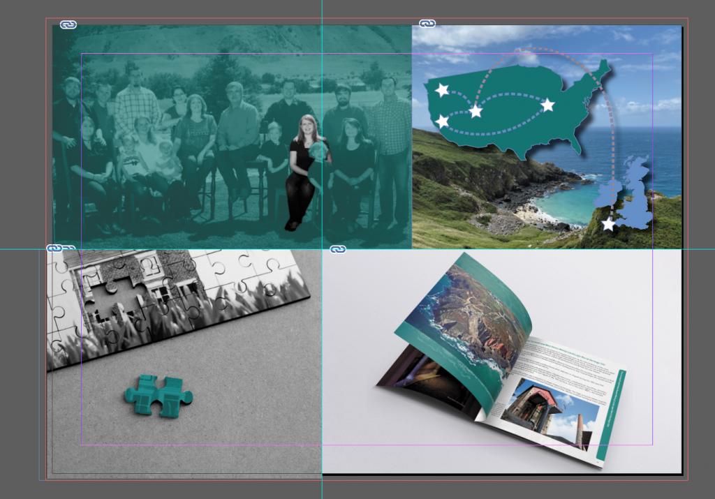
Instead of leading your eye around, it caused an abrupt severing. I tried moving the section in different ways to prevent this, but it did not come together.
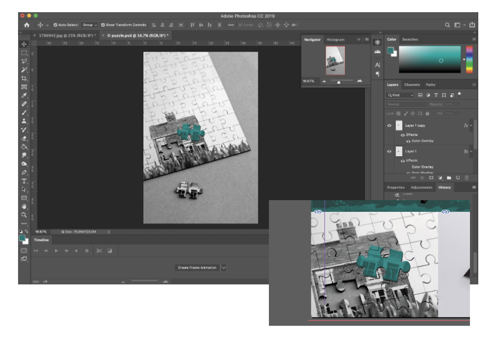
Back to photoshop! I cut the piece out and moved it further up the image, which let me crop the final panel much more tightly and pull the focus where I wanted it.
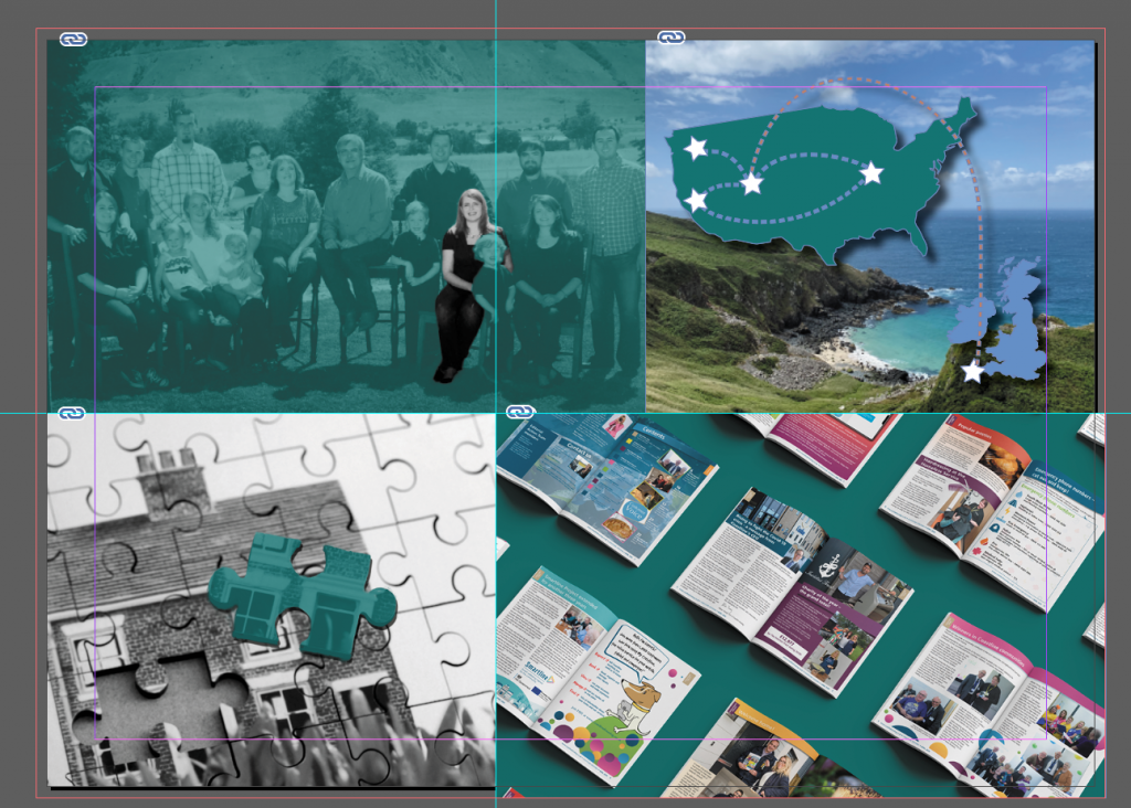
I had a similar issue with the bottom panel. I had edited the background colour of this magazine collage, but it was too colourful and busy. The shot of the Geevor Guidebook was cleaner.
Summary of the week
What struck me this week was the sheer breadth of graphic design. The industry is always changing and adapting to new technologies – it is more useful to characterise graphic design as a way to think about the world and explore ideas than a specific thing you do, verb it! Developing a curiosity, a visual language, being open to inspiration and doing the work are foundations to an effective career as a designer. Back this up with technical skills and always be open to developing.
References
Abstract- The Art of Design Season 1 Episode 6- Paula Scher- Graphic Design [Streamed]. 2017. Netflix.
ARGENT, Patrick. 2016. “Where Are All the Older Designers? | Design Week.” Design Week [online]. Available at: https://www.designweek.co.uk/issues/8-14-february-2016/where-are-all-the-older-designers/ [accessed 13 Oct 2020].
BORIS, S., FINN, T., HOUSE, J., MANCHIPP, S., SOELLING, K., WINSTON, S. 2020. Week 1 [lecture]. GDE710 for MA Graphic Design. Falmouth: Falmouth University 2020 [Accessed 13 Oct 2020]
BROOK, Tony and Adrian SHAUGHNESSY. 2009. Studio Culture : The Secret Life of the Graphic Design Studio. London: Unit Editions.
INTEL LIFE. 2013. “Intel Visual Life – Michael Wolff | Intel.” Youtube.com [online]. Available at: https://www.youtube.com/watch?v=BTfAzjBTokc [accessed 13 Oct 2020].
THAM, Preston. 2019. “DESIGN EVERYWHERE.” Tumblr.com [online]. Available at: https://designeverywhere.tumblr.com/ [accessed 13 Oct 2020].
VISUELLE. 2020. “Home – Visuelle.” Visuelle.co.uk [online]. Available at: https://visuelle.co.uk/ [accessed 13 Oct 2020].
YATES, Derek and Jessie PRICE. 2015. Communication Design. New York: Fairchild Books Ava.
