Lecture with Stuart Tolley
Anna Gerber & Britt Iverson
Adrian Shaughnessy – The graphic designer as writer, editor and publisher
This week we examined visual writing and designers who write. Tone of voice is very important to a project and can be conveyed by production methods, typography design and visual cues as well as language. I’m especially interested in how print and production methods can add to a project, as that is something I work with in my professional practice. How you present something can often be just as important as what you are saying.
A great example is “Things I Have Learned in My Life So Far” by Stefan Sagmeister. A beautiful collection of maxims that explore message, meaning and typography. The book is composed of smaller chapbooks that slot into a die-cut cover. This enables a viewer to change the order of the booklets and interact with the cover in an innovative way. Since its release in 2006 the book frequently sells out and has been updated with an extra 48 pages in 2013.
“In this series, the message is always very clear and straightforward, the typography much more ambiguous and open for interpretation. I found that by utilizing an open typographic approach combined with the clear message many viewers have an easier time relating their own experience. We do employ various typographic strategies from one project to another (within the series). Some are influenced by the environment they take place in, some by an outside person, some by personal experiences.” (“Answers – Stefan Sagmeister” 2015).
Sagmeister collaborates with other artists and designers, creating public pieces of art as well as smaller pieces. The maxims are clear and short, but the beauty of the typography and playfulness of the layout allow a reader to engage with them. The book invites readers to interact with it in a personal way, with each reading a unique experience. Exploring interactivity and making a book an experience was also touched on in the lecture by Anna Gerber and Britt Iverson. The duo say “We believe that stories are at the centre of human connections. All the work we do is about making those great stories possible and accessible to people.” (Visual Editions, 2021). I think there is a fine line between novelty for the sake of novelty, and innovation that allows a designer to connect more directly with readers, taking them on a journey or uncovering hidden insight. Exploring this line is an exciting prospect that could motivate an entire career.
Workshop Challenge
This week we want you to analyse how a tone of voice is utilised by writers to emphasis a narrative and generate your own written and visual content that explores the relationship between content and form.
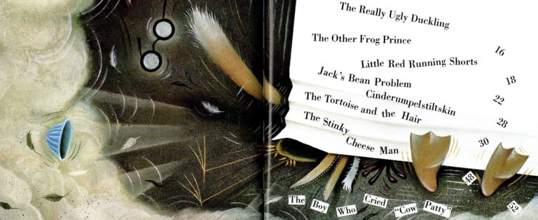
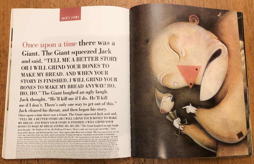
The first example of tone of voice that leapt to mind was The Stinky Cheese Man and Other Fairly Stupid Tales. The Stinky Cheese Man was a combined effort between longtime collaborators Jon Scieszka, illustrator Lane Smith and designer Molly Leach. The book is full of deconstructed fairytales, stories turned on their head with text being squashed and pouring off of the page. Characters interrupt other character’s stories or break the fourth wall. The tone is irreverent and deeply silly to the delight of children and adults alike.
Nothing is quite as expected, the ugly duckling merely becomes a very ugly duck. A meta narrative runs through the book, playing on the concept of children’s books themselves. The title page is placeholder text, the table of contents falls, and crumples to the ground with page numbers and story names crushing characters. Other characters walk out of the book, refusing to take part and a giant demands a better story over and over with the typography becoming smaller and more cramped until it finally falls off the page.
The book is now recognised as a children’s classic, winning a Caldecott Honor medal in 1993, but at the time publishers were uninterested. It relies on a seamless relationship between the text, illustrations and book design in a way that was shocking and innovative at the time, and until those elements were brought together Scieszka and Smith had difficulty selling it.
Children’s books are dear to my heart, but I knew that for this week’s challenge I would not be able to devote enough time to illustrations. I decided to focus on books for slightly older children, taking inspiration from classics such as The Phantom Tollbooth, and indeed another collaboration between Scieszka and Smith, The Timewarp Trio. These books are aimed at readers on the cusp of childhood, young enough to still appreciate illustrations, but old enough to enjoy more complex story telling.
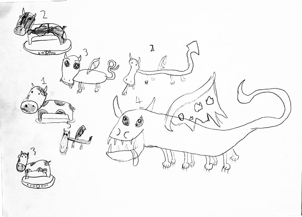
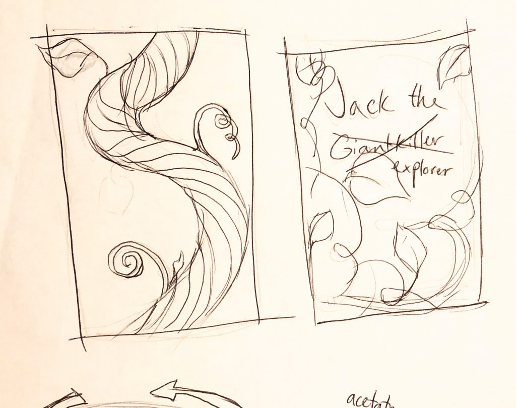
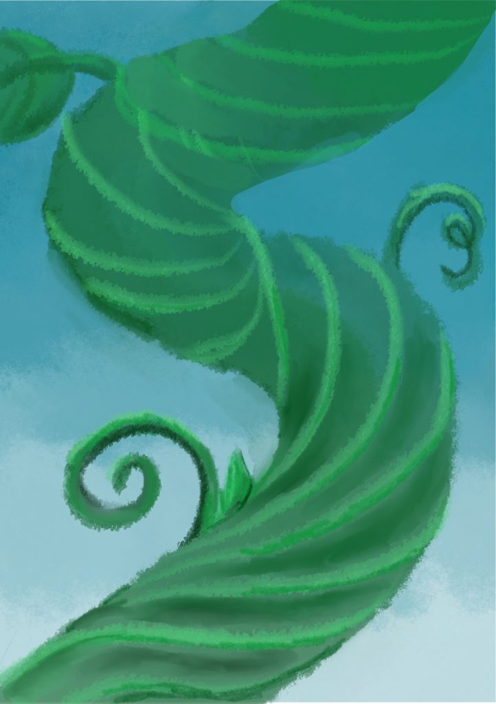
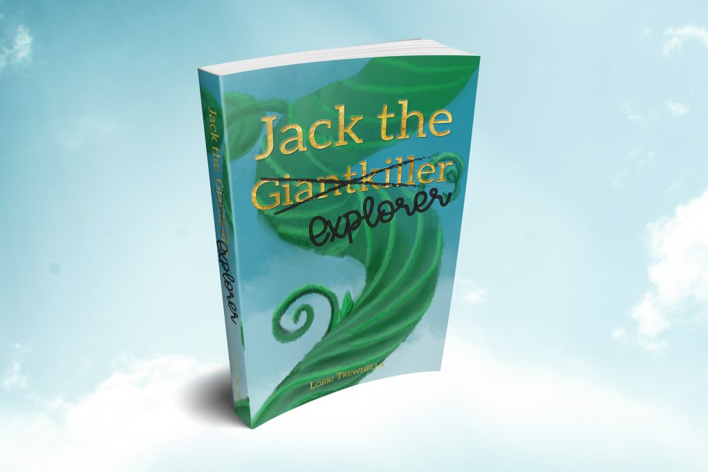
I settled on a Jack and the Beanstalk mashup, my Jack coming from a long line of giant killers. Jack is pushed to start his traditional narrative by an interfering mother, but what happens when he decides to reject the family profession and strike out on his own? 400 words is not enough to establish a full narrative, but I wrote a short first chapter and sketched out chapter headings for the rest of the book. Jack is determined to do things how own way, and sets out to explore the world around him with his trusty miniature wyvern and a magical pack of camping equipment. He discovers that monsters are no different than the rest of us, and makes friends and learns about himself along the way. I set it as a very traditional paperback book, envisioning small illustrations at the beginning of each chapter, combined with more occasional full page line drawings and a fantasy map folding out of the front.
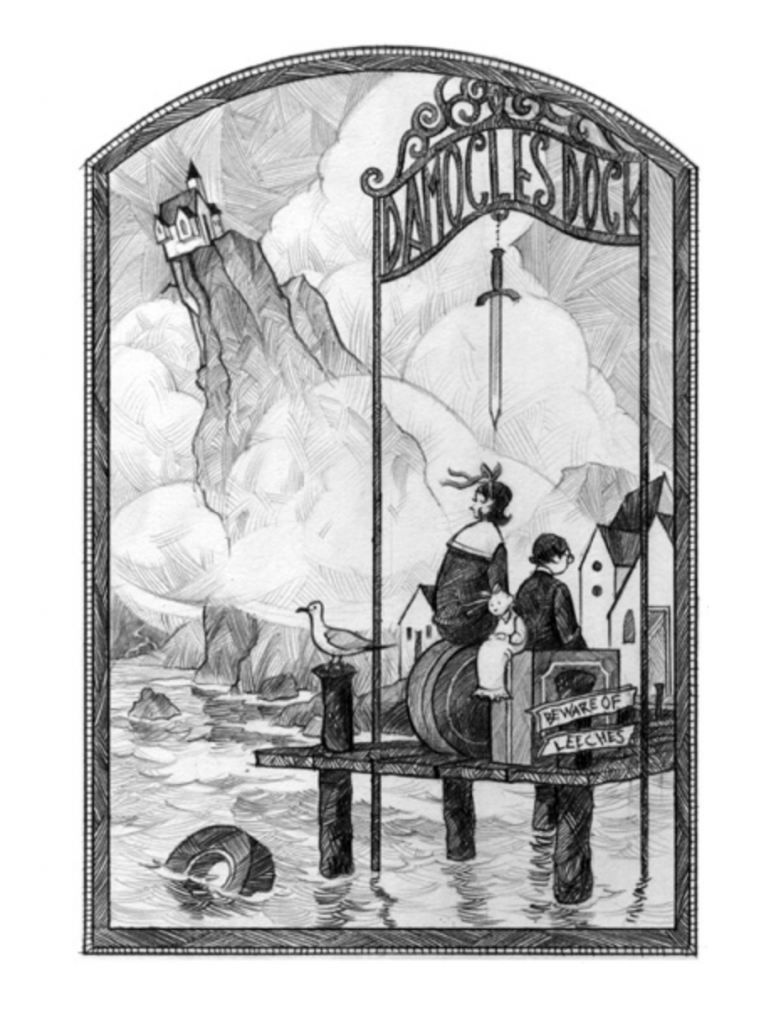
I commissioned my 9 year old to illustrate some chapter headings and sketched out a quick cover in Procreate and InDesign.
Reflection
I love books but I am not a writer! This week was challenging, though I found myself enjoying the writing in spite of myself. I set the book up in a no-nonsense fashion with an easy to read serif font, I used italics and different font sizes to emphasis the strident tones of Jack’s mother, and created page furniture and style guides. On the cover I wanted to create a sense of movement and grafitti, as though Jack has taken a marker to the nice foiled future his mother has planned for him and started to create his own path. I would have liked to create a custom hand-drawn piece for the “explorer” text, but did not have time. I also created chapter names for the rest of the book, and found myself working out a general plot. By the end of the week 400 words wasn’t enough!
I’m still not a writer but I enjoyed this project a great deal. I feel I was successful at hitting the tone I was going for, and my homemade focus group agreed, begging me to tell them what happened next. With more time I would have liked to develop illustrations and perhaps a few more chapters.