Lecture with Joe Pochodzaj
The lecture explored the power of data and a designer’s role in explaining and crafting a narrative. How do we collect and analyse data? What are we using data for? How can we use data to tell a story, and do so responsibly?
Data engineering is can be truly influential, for good or ill. It can be easy to forget that figures and statistics represent real people with real stories when arguing a larger point, and it is important for designers to be aware of the ethical implications of manipulation in design. Pochodzaj’s point about information graphics providing an antidote to political manipulation was especially impactful (Pochodzaj, 2021). Analysing sources and fact checking is an incredibly important skill in the modern world. Watching the US elections from England has been especially disheartening this last year, while manipulation and “fake news” has run riot. It is impossible to outstrip the number of poorly photoshopped truth claims that pop up on social media, my sister continues to valiantly fact check an elderly aunt on Facebook and it truly is a Sisyphean task! We must constantly try to filter our information and put our trust into reliable sources.
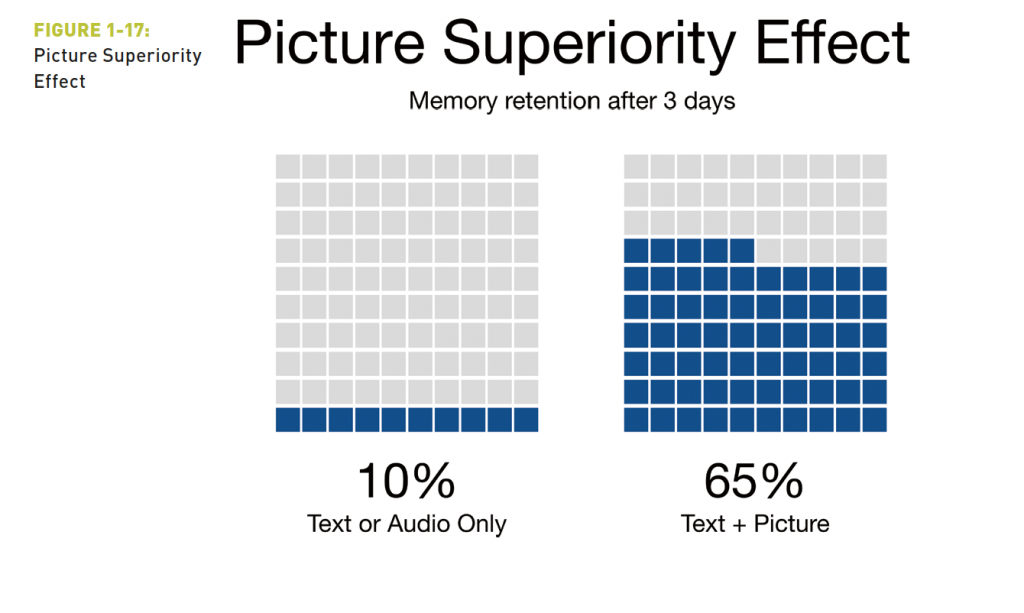
According to Randy Krum in his book Cool Infographics “…when we read text alone, we are likely to remember only 10 percent of the information 3 days later. If that information is presented to us as text combined with a relevant image, we are likely to remember 65 percent of the information 3 days later!” (Krum, 2014 pg 44) This doesn’t pertain to just any text and graphic combination – the image must be related to the text, and reinforce the message of the text, but when that combination is used it makes a long lasting impression.
This is why organisations like Forensic Architecture are vitally important. They investigate events and human rights violations, examining and analysing facts from every angle. Interviews, eyewitness accounts, and footage from multiple sources are collected and analysed, combined with innovative technological techniques to get to the heart of an event and uncover truth in an unconventional manner. In an interview with Artnet News, Eyal Weizman explained how AR allowed them to create a full scale photogrammetry of the neighbourhood where an incident had taken place and collect and corroborate witness testimony and experience that would not otherwise have been possible.

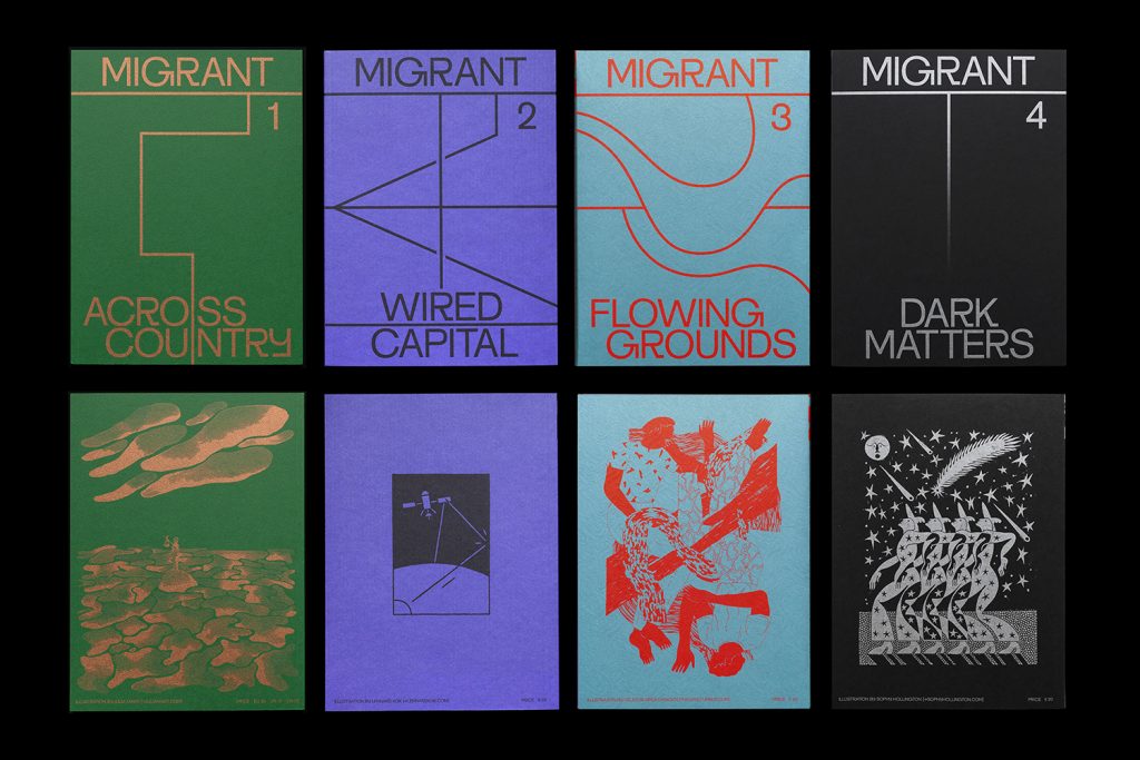
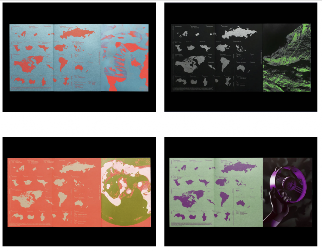
Migrant Journal is another impactful project. By keeping the scope of the project tight, with a limit to the number of issues from the beginning, each issue is critical. Working with many collaborators to tell real stories brings humanity to facts and figures. The emphasis on print and production quality creates value and draws attention to a project that may have been buried on a purely digital platform (Boddington, 2018). This creates engaging material that will be kept and valued, as Christoph Miler mentions – enhancing the experience through offering a tactile and visual product (Miler, 2018). I appreciated Miler’s point that everyone who worked on the magazine is also a migrant, none of them live in the country they hold a passport of (Miler, 2018). The term “migrant” is so loaded politically and socially.
Justinien French tells It’s Nice That, “I’m still digesting how the fact that we’re not based in the same countries has influenced the project. Obviously, it’s part of our story, because even though we are all privileged migrants – we have degrees, we made the choice to move to these countries because we felt we wanted to, for whatever reasons, may they be personal or professional and we can go back to our country whenever we want – there’s still an experience of migration, which, as far as I’m concerned [currently living in London] has been even more difficult since Brexit.”
I have experienced this myself as I am an immigrant who isn’t automatically “othered” by my appearance or name. I’m frequently confronted by xenophobic and racist reactions from people who think I am “safe”, who quickly backtrack when reminded of my status. This results in bizarre microaggressions from people trying to assure me that “I don’t count” or am “one of the good ones” or “I didn’t mean YOU” and exposes hidden prejudice.
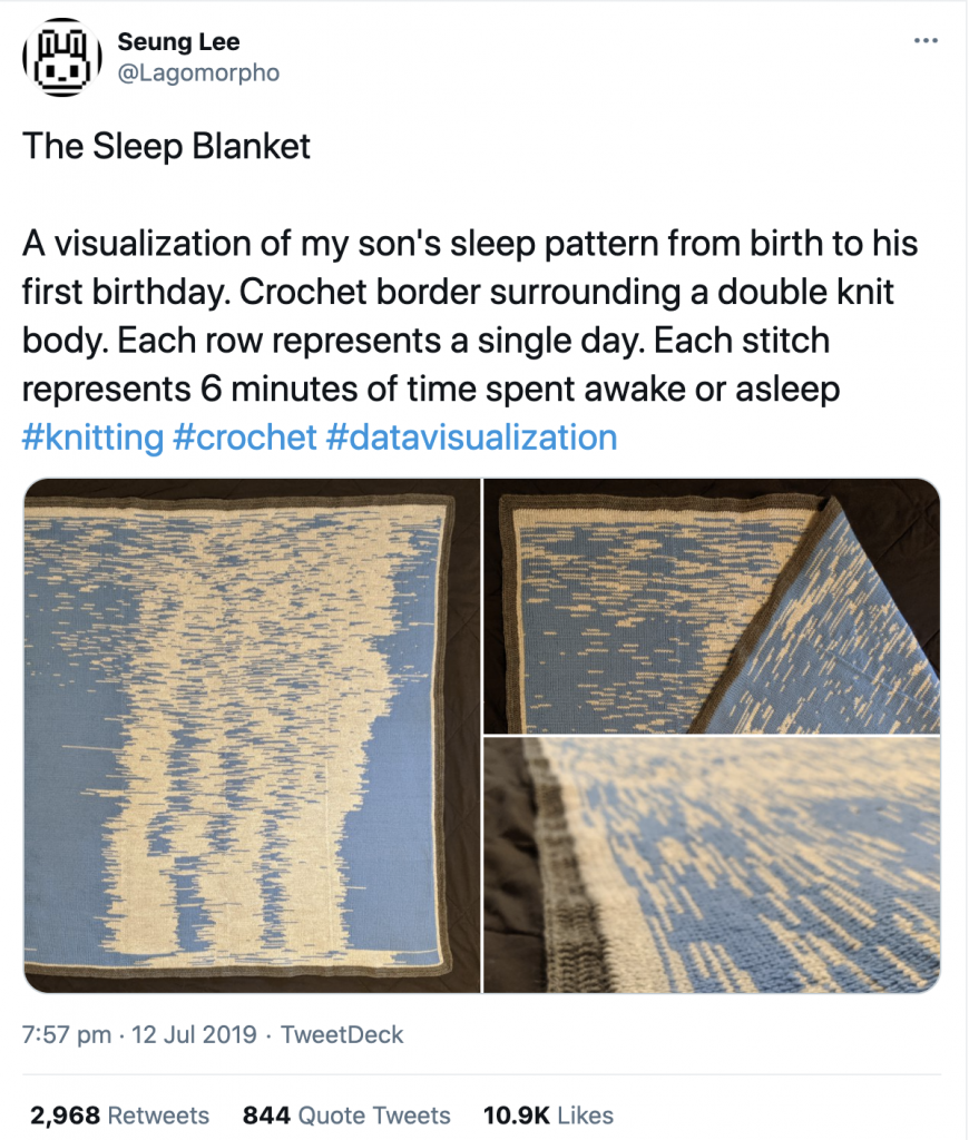
Information design is not restricted to charts, printed material or web applications. Seung Lee created a knitted blanket documenting his son’s sleep patterns for an entire year. He used an app to collect the sleep data before filtering it and programming bespoke tools to convert it to a knitable pattern. The result is striking and beautiful and took a nearly a year to plan and knit. You can clearly see shifts and changes in the sleep patterns, and the early scattered days are instantly relatable to anyone who has cared for an infant, calling up strong memories of your own experiences.
Workshop Challenge
Source a scientific, cultural or environmental story that matters to you.
Create a piece of information design to communicate its information and reveal a new insight.
I struggled with finding a topic this week. I looked into several options, including immigration and microplastics in the ocean, but they were all very negative and I was finding it difficult to engage with them. I attended a student organised group crit to talk over my ideas and it was tremendously helpful. I brought up a bit more lighthearted idea I had had earlier in the day – pancakes!
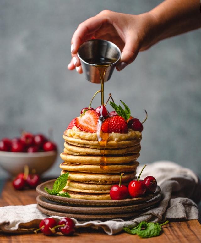
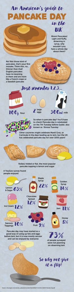
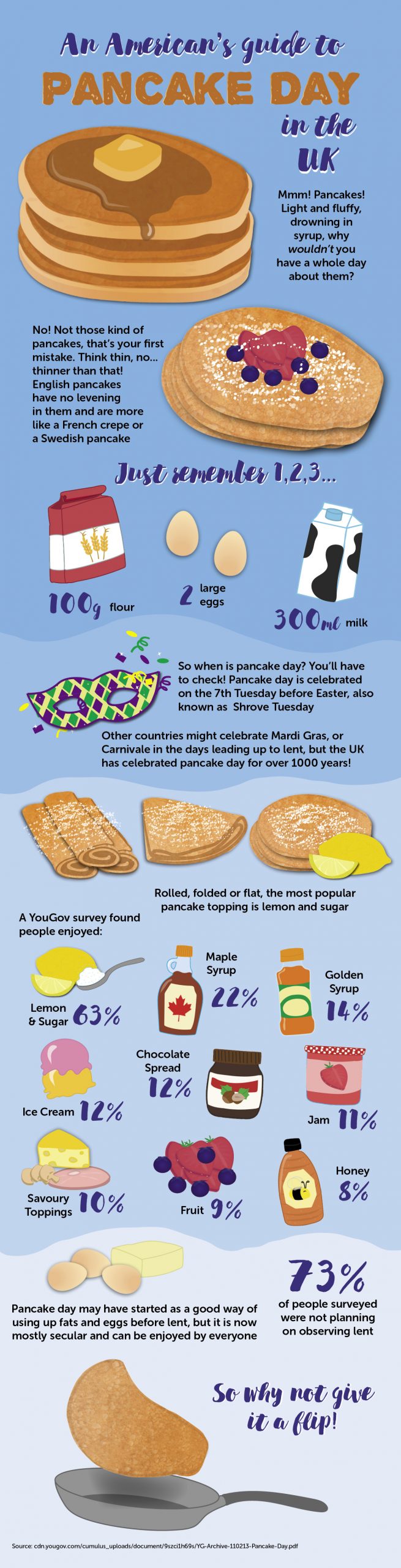
When I had first moved to the UK I found pancake day completely baffling. No one could explain why pancakes were eaten on a random winter day and it took a while before I discovered the origins and meaning behind pancake day. In speaking to other Americans I found I was not alone, so I did some research and found several YouGov surveys relating to pancake day as well as facts and historical background. I also looked into different types of pancake around the world. I decided on a lighthearted, chatty, infographic with a conversational tone to explain pancake day to Americans.
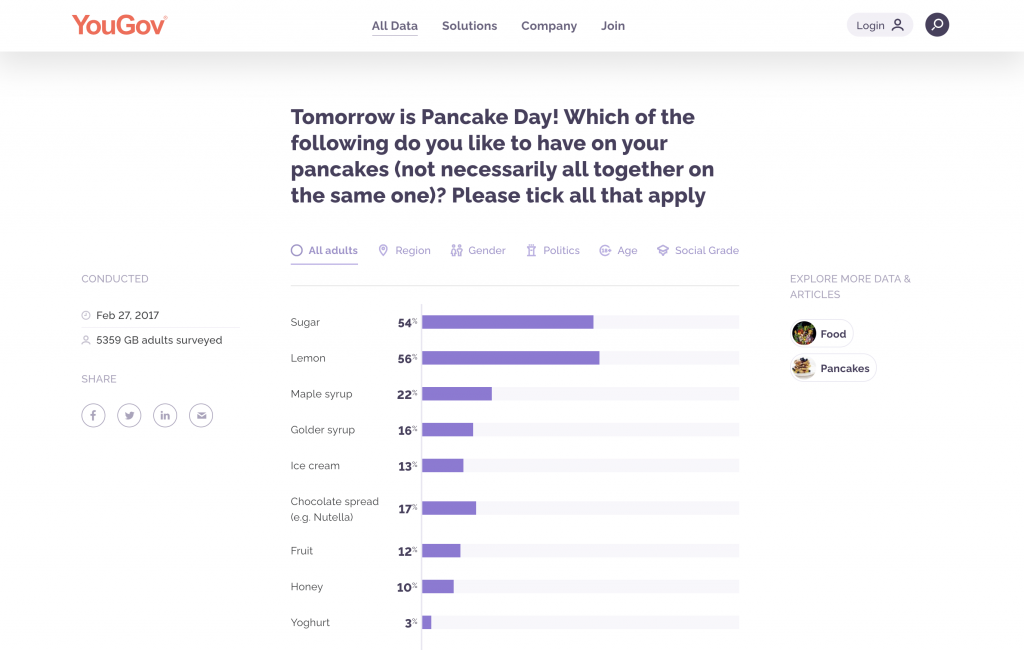
The pancake data was fairly in-depth, asking about plans to make pancakes, number of pancakes to be consumed, favoured toppings, and plans to give something up for Lent. Participants were also split according to age, social grade, region, voting intention and voting history. As I was mostly interested in a lighthearted informative graphic, I focused mostly on the favourite toppings from the survey results.
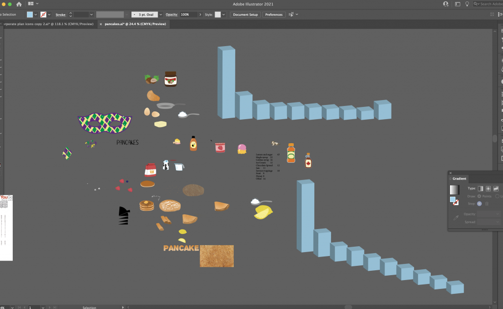
My original plan was to create an isometric exploded pie chart, with illustrations of each topping above the chart. Unfortunately the topping question had asked participants to choose up to three options, so the percentages were purely out of numbers of respondents rather than as a total. I tried using a stepped bar graph next, but this didn’t fit the long scrolling layout I had chosen for the graphic and did not add anything to the design.