
Lecture with Harriet Ferguson
Visual communication has existed from the time human beings learned to use tools. Harriet’s lecture reminded me of the trip my family took to Lascaux in 2019 to see the famous cave paintings. As the actual paintings are incredibly precious and in danger from environmental damages, they are sealed off and a life sized replica is open to the public. The replica took several years to build, using 3D mapping technology and a team of artists faithfully recreating the cave paintings inside. This also allows the cave complex to be navigable, as the real painting chambers can be remote and difficult to access.
Arriving at the visitors centre you are taken on a guided tour through the replica, which is a striking and accurate facsimile. Generations of artists painted and carved over one another, layering horses, aurochs, and broad swathes of colour over the cave walls and ceilings. Several portions of the cave are easily overlooked, with paintings tucked into nooks and crannies, or high above you. Luckily a knowledgable guide will point them out to you before you are released into the interactive exhibit space. Every visitor is equipped with headphones and a tablet, which allow you to navigate and interact with the exhibit spaces. Portions of the cave system are suspended from the ceiling, with animations, charts and images projected depending on what you choose to learn about. This is in conjunction with a 3D film, immersive historical documentaries and opportunities to have a go at digital cave paintings yourself.
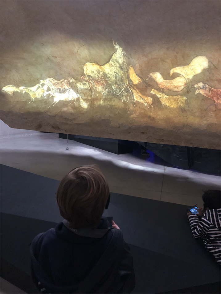

The result is a fantastic educational experience that brings up more questions than it answers. The truth is that what we don’t know about the people who painted and carved these caves far outweighs what we do know. This lack of information does not stop the images from being immensely relatable and engaging on a human level. They stir our curiosity and make us want to know more about the people who created them.
“Even before the terms ‘information design’ or ‘infographics’ were used, the human race was using visual techniques to express complex thoughts in a simple image. Al Shalloway, creator of the Lean/Agile method and founder of Net Objectives, described it simply as ‘Visualisations act as a campfire around which we gather to tell stories.’” (Ferguson 2021)
Story telling, organising information and sharing it is at the heart of this week. How do we collect and organise information to get that story across, to make the complex accessible and easy to engage with?
Workshop challenge
This week we want you to analyse one of the pre-selected examples of information design to determine its effectiveness. Consider clarity, communication, message and the role of design in communicating the message to you. Be critical and write a synopsis about its effectiveness, which we want you to present as a piece for editorial design.
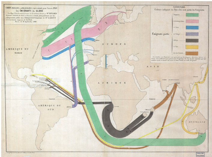
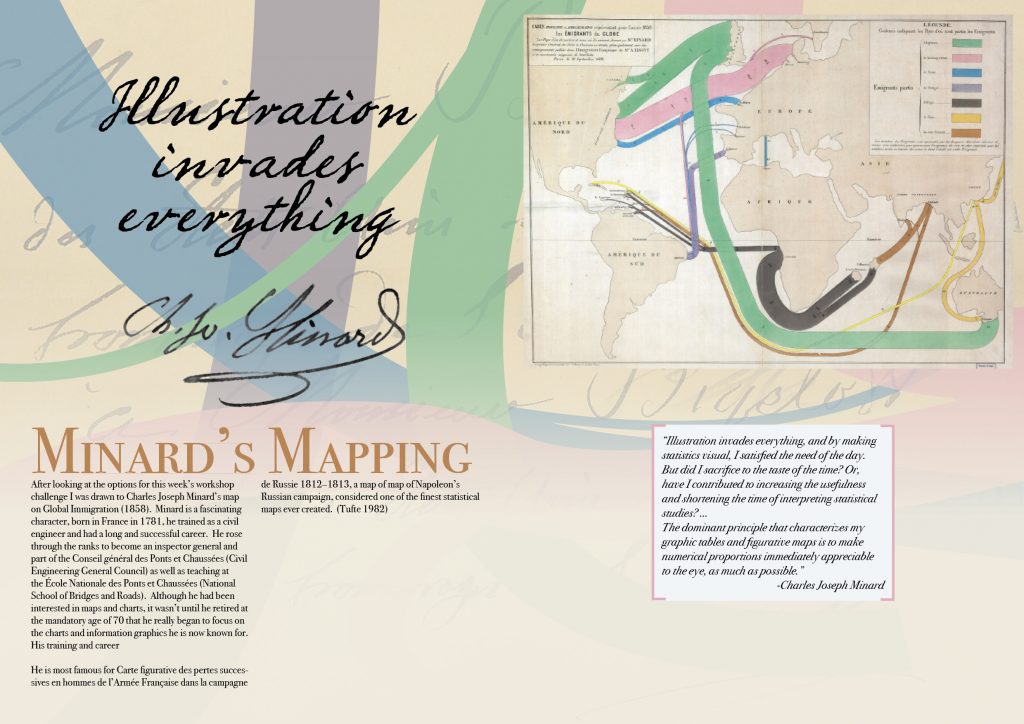
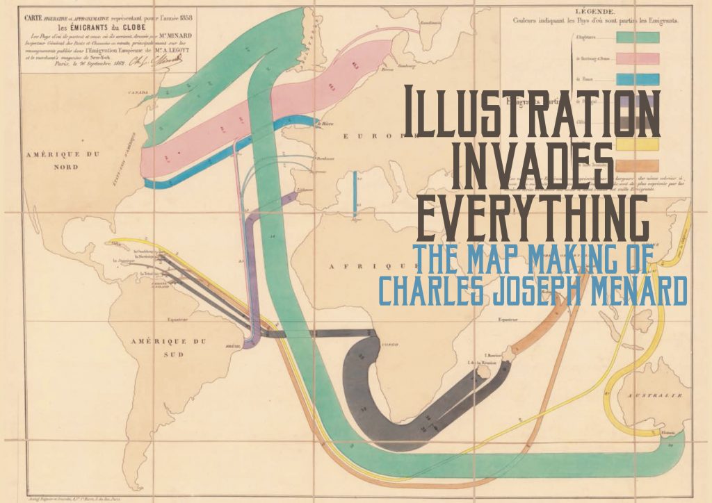
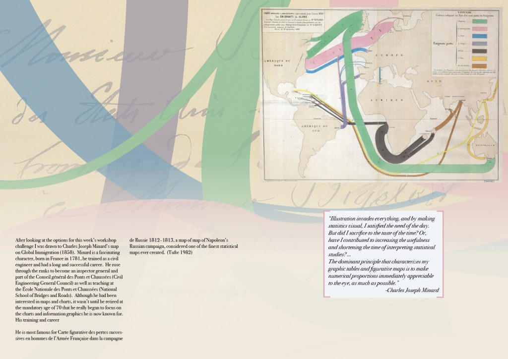
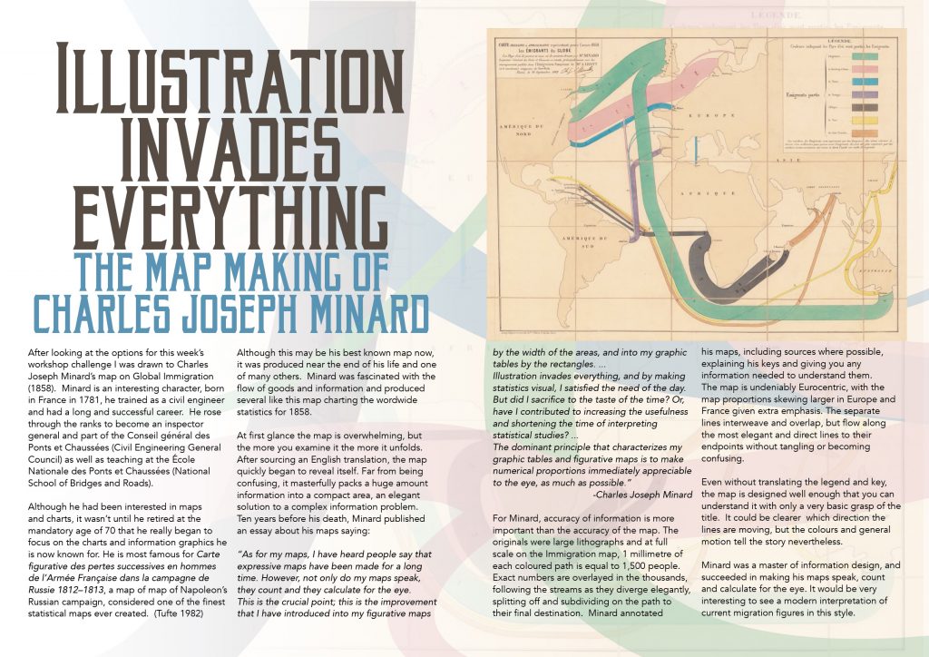
After looking at the options for this week’s workshop challenge I was drawn to Charles Joseph Minard’s map on Global Immigration (1858). Minard is an interesting character, born in France in 1781, he trained as a civil engineer and had a long and successful career. He rose through the ranks to become an inspector general and part of the Conseil général des Ponts et Chaussées (Civil Engineering General Council) as well as teaching at the École Nationale des Ponts et Chaussées (National School of Bridges and Roads).
Although he had been interested in maps and charts, it wasn’t until he retired at the mandatory age of 70 that he really began to focus on the charts and information graphics he is now known for. He is most famous for Carte figurative des pertes successives en hommes de l’Armée Française dans la campagne de Russie 1812–1813, a map of map of Napoleon’s Russian campaign, considered one of the finest statistical maps ever created. (Tufte 1982) Although this may be his best known map now, it was produced near the end of his life and one of many others. Minard was fascinated with the flow of goods and information and produced several like this map charting the wordwide statistics for 1858.
At first glance the map is overwhelming, but the more you examine it the more it unfolds. After sourcing an English translation, the map quickly began to reveal itself. Far from being confusing, it masterfully packs a huge amount information into a compact area, an elegant solution to a complex information problem.
Ten years before his death, Minard published an essay about his maps saying:
“As for my maps, I have heard people say that expressive maps have been made for a long time. However, not only do my maps speak, they count and they calculate for the eye.
This is the crucial point; this is the improvement that I have introduced into my figurative maps by the width of the areas, and into my graphic tables by the rectangles. …
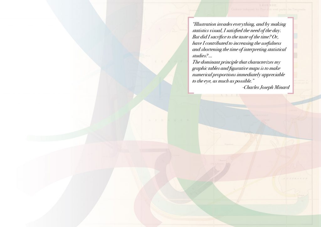
Illustration invades everything, and by making statistics visual, I satisfied the need of the day. But did I sacrifice to the taste of the time? Or, have I contributed to increasing the usefulness and shortening the time of interpreting statistical studies? …
The dominant principle that characterizes my graphic tables and figurative maps is to make numerical proportions immediately appreciable to the eye, as much as possible.”
-Charles Joseph Minard
For Minard, accuracy of information is more important than the accuracy of the map. The originals were large lithographs and at full scale on the Immigration map, 1 millimetre of each coloured path is equal to 1,500 people. Exact numbers are overlayed in the thousands, following the streams as they diverge elegantly, splitting off and subdividing on the path to their final destination. Minard annotated his maps, including sources where possible, explaining his keys and giving you any information needed to understand them.
The map is undeniably Eurocentric, with the map proportions skewing larger in Europe and France given extra emphasis. The separate lines interweave and overlap, but flow along the most elegant and direct lines to their endpoints without tangling or becoming confusing.
Even without translating the legend and key, the map is designed well enough that you can understand it with only a very basic grasp of the title. It could be clearer which direction the lines are moving, but the colours and general motion tell the story nevertheless.
Minard was a master of information design, and succeeded in making his maps speak, count and calculate for the eye. It would be very interesting to see a modern interpretation of current migration figures in this style.
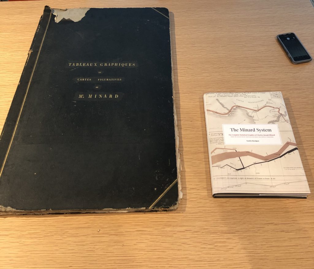
I found setting this editorial quite difficult. I wanted to showcase the map as much as possible. Paul Kahn, a lecturer at Northeastern University, visited the ENPC Archives and wrote an excellent photo essay about Minard’s original lithographs. You can see the scale of the folio here:
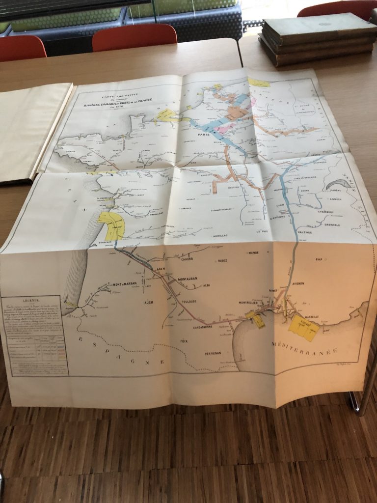
Several of the original maps are even larger, such as this map unfolded to full size and spilling off of the table.
References
“Discovering Charles Minard: Information Design, Numerical Magnitudes, and a New Understanding of an Old Technique.” 2017. The New York Public Library [online]. Available at: https://www.nypl.org/blog/2017/01/06/rare-gem-information-design [accessed 13 Feb 2021].
“Edward Tufte Forum: The Work of Charles Joseph Minard.” 2020. Edwardtufte.com [online]. Available at: https://www.edwardtufte.com/bboard/q-and-a-fetch-msg?msg_id=0003mn [accessed 13 Feb 2021].
“Illustration Invades Everything – Info We Trust.” 2019. Info We Trust [online]. Available at: https://infowetrust.com/project/minard1861 [accessed 10 Feb 2021].
KAHN, Paul. 2019. “Global Information Design: A New Framework for Understanding Data Visualization.” Medium [online]. Available at: https://medium.com/nightingale/global-information-design-a-new-framework-for-understanding-data-visualization-9bc8bff15852 [accessed 8 Feb 2021].
KAHN, Paul. 2020. “Touching Minard – Nightingale – Medium.” Medium [online]. Available at: https://medium.com/nightingale/touching-minard-6398274e07ef [accessed 23 Feb 2021].
“Minard on Immigration.” 2008. Cartographia [online]. Available at: https://cartographia.wordpress.com/2008/05/12/minard-on-immigration/ [accessed 10 Feb 2021].
“The Underappreciated Man behind the ‘Best Graphic Ever Produced.’” 2017. National Geographic News [online]. Available at: https://www.nationalgeographic.com/news/2017/03/charles-minard-cartography-infographics-history/ [accessed 10 Feb 2021].