Lecture with Stuart Tolley and Colophon Foundry
Dan Rhatigan on Ryman Eco
Creative Review podcast episode 14
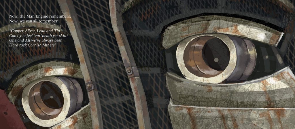
While listening to the lectures and information this week I kept coming back the idea of the Cornish identity and language. I may be American, but my husband’s family is as Cornish as they come, and this is my children’s heritage through and through. When the Man Engine came to Hayle in 2016, we took the boys and joined in the crowd of thousands packed into Foundry Square. I sat my son on my shoulders as the crowd chanted “Kober! Arghans! Sten! Sten! Sten!” to encourage the massive steam powered puppet to raise itself to its full height.
My youngest had a virtual school assembly with Will Coleman last week. Coleman is an author, film maker, musician and the founder of Golden Tree Productions. He is responsible for the Man Engine, and Kerdroya, a massive labyrinth being made with traditional Cornish hedgework. His work is deeply Cornish and he is passionate about preserving the language and culture of Cornwall. Coleman spoke about the history of the Cornish language and watching the change from Cornish to English sweep across a map was quite saddening. Cornish is a Celtic language with close ties to Breton, Welsh, Manx, Irish Gaelic and Scots Gaelic. Unfortunately it was completely eradicated by the 1770’s, and has undergone a modern revival. Cornish has a tenuous hold compared to Welsh, but is a deep part of the local history and heritage. In addition to Cornish, it also has its own English dialects, with many uniquely Cornish words and phrases.
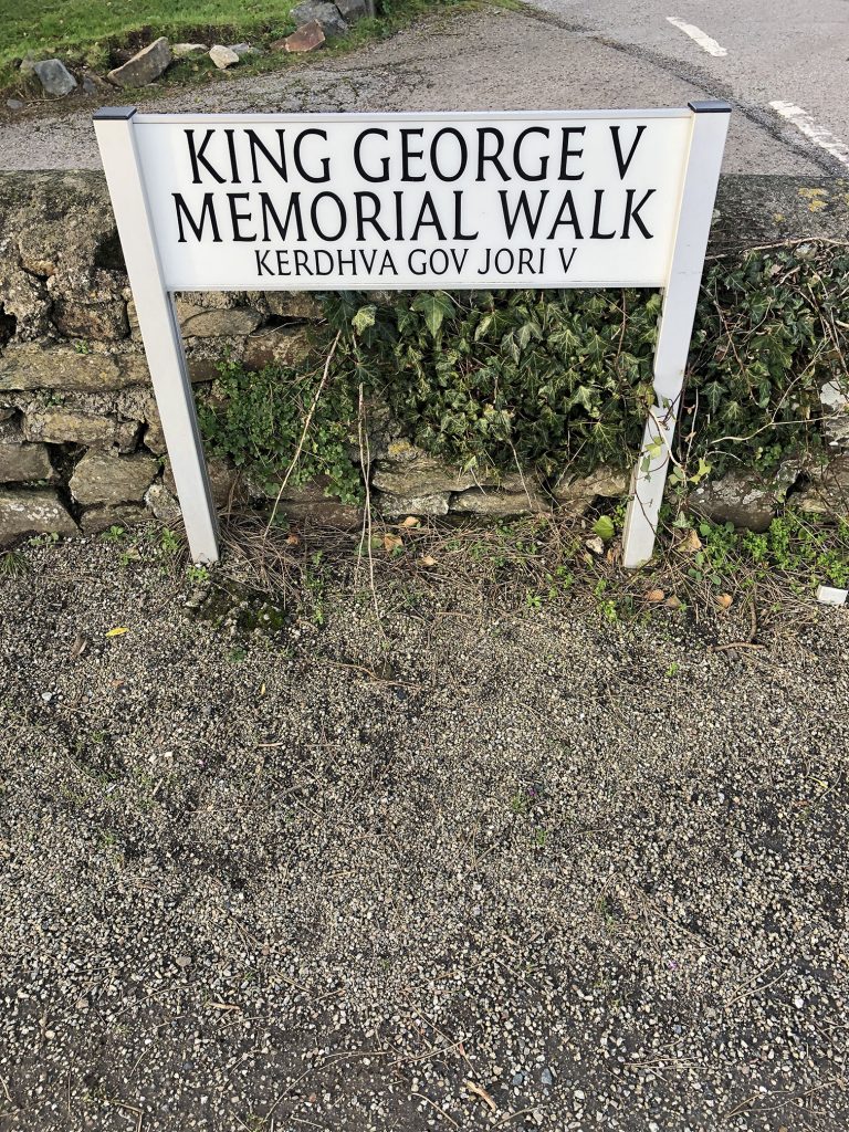
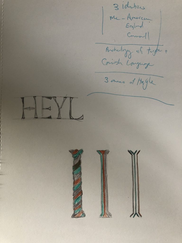
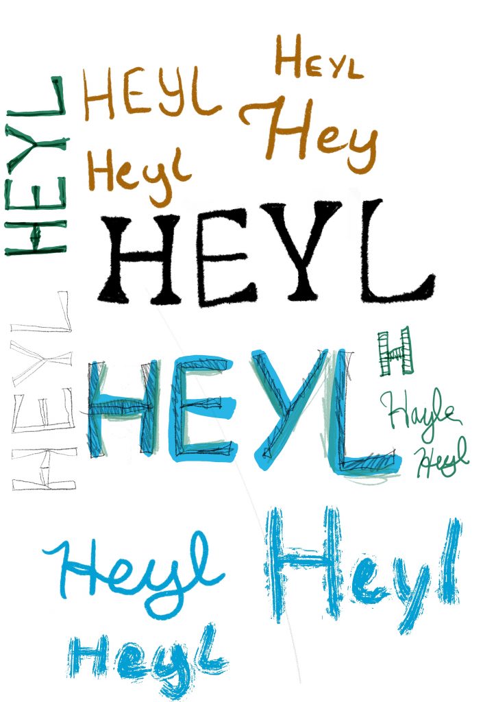
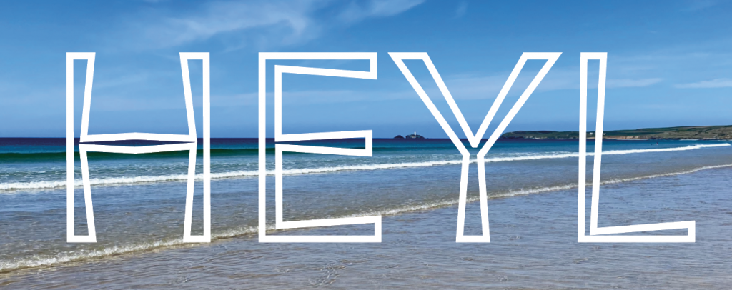
In Hayle, several of the street signs include the Cornish version under the English. Watching the lecture with Colophon Foundry was very inspiring as they spoke about developing Cymru Sans. Their point about respecting the heritage of a place but bringing into a new light struck a chord with me. I decided to focus on the Cornish version of the town name – Heyl, which means estuary in Cornish.
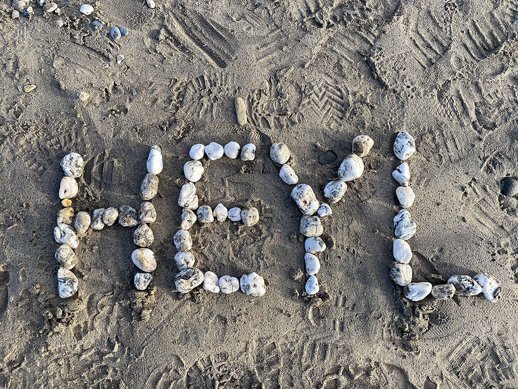
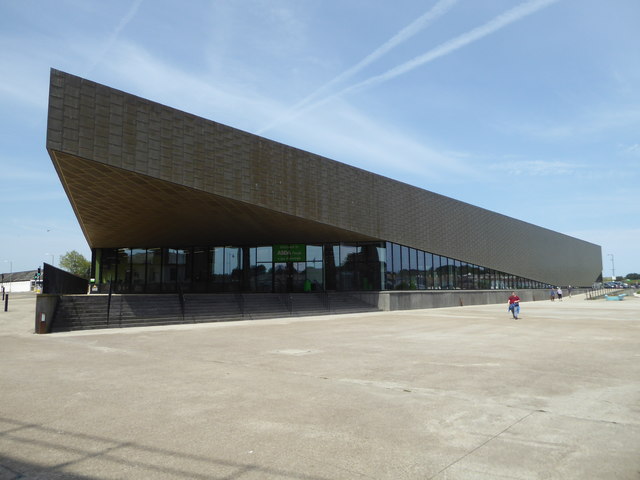
Hayle has always been a place of settlement, with artefacts stretching back to the Roman era, but it wasn’t an established town until the industrial revolution. I knew I wanted to include the three threads of the town- Foundry, Copperhouse and the Towans into the design somehow. I started looking at the signage around town, and made a simple sign on the beach with my family using stones.
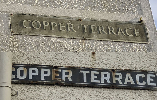
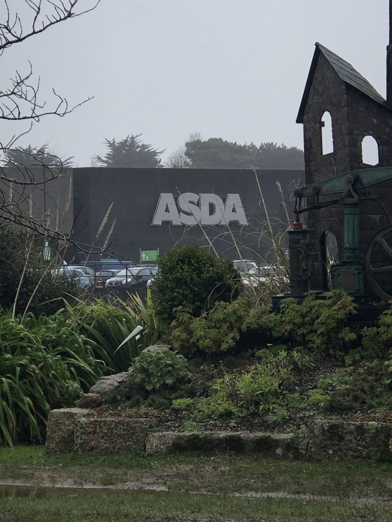
Signage is incredibly inconsistent throughout the town – these two signs are on the same street, just a few houses apart. In spite of this, Hayle has very definite ideas about what is appropriate and acceptable as a world heritage site, as Asda found when they built a new store on East Quay. While the design of the building itself is still controversial, what everyone can agree with is that the stainless steel Asda sign itself was a triumph of the local government vs. a multinational company. It is the only Asda in the country without their signature lime green lettering.
I kept thinking about how I could incorporate the iron, copper and beach into my typography. I tried a few different things, twining the three elements together, and even tried harvesting clay from the local beach. (This was not effective, it was mixed with too much sand and I could not get anything usable out of it.)
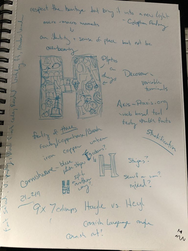
I tried handlettering in different formats, but felt they were all weak and not developing well. There is a vast gap between designing a letterform and handwriting, but I could not bridge this gap in my mind. Every time I would try to draw a letterform I found myself writing it instead. I needed to find a way to trick my mind into letting me focus on shapes and forms rather than insisting I was “writing”.
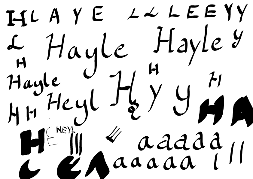
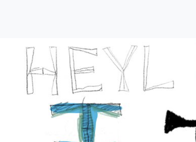
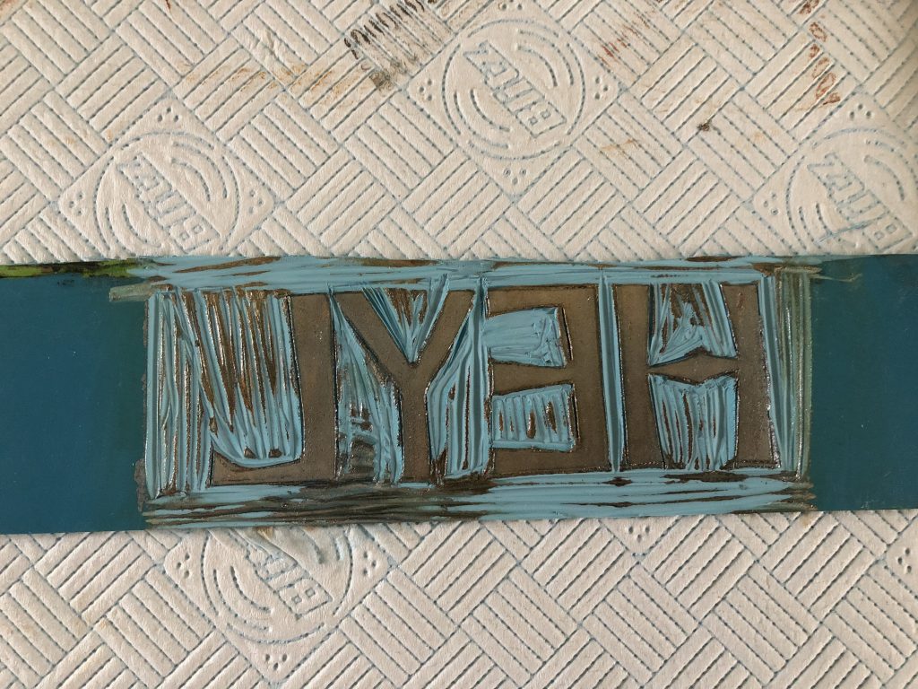
In a tutorial early in the week I had been encouraged to step away from the computer and try something different rather than jump straight to a finished polished piece, and I kept coming back to the idea of linoblock prints. First I needed a firm idea of what I’d be cutting, and I kept coming back to these angular forms so I worked them up in Illustrator.
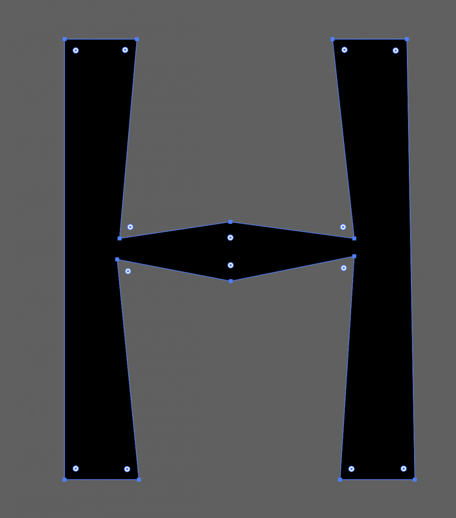
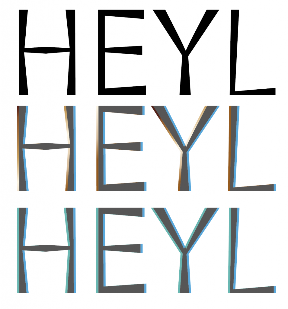
I tried a few options with just the letterforms, overlapping and using colour to represent the iron, copper and towans. I liked the overlap and visual blurring as well as the angular outlines.
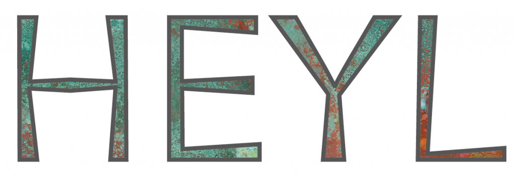

When I added some actual copper into the mix it really started taking shape. I’d love to be able to make this a cast sign, that could weather and develop a real patina, or inks with real metallic flakes. I ordered some metallic printing ink, but I’m