Lecture with Kristoffer Soelling
New Perspectives in Typography by Scott Williams and Henrik Kubel
Structure in Type and Typography by Phil Baines and Andrew Haslam
Typography is such an important part of design, but it can often be overlooked or taken for granted. The invention of language, alphabets and printing has enabled human growth and development, made it possible to record, share, educate, spread culture and knowledge throughout the world. The history of type and printing is a fascinating journey, and the technological advancements have brought more and varied tools to our fingertips than ever before. Setting a book in the past would have had many restrictions. Typefaces were physical objects, and a printshop would only have so many available to choose from. Setting a page was a complicated and physical act, requiring trained professionals, equipment and time. With the advent of personal computers, so many typefaces, of variable quality, are now easily available. I feel this is both a blessing and a curse, however.

In Anthony Burrill’s guest lecture he talked about working within restrictions, keeping work simple and including only what is necessary to let work speak for itself. (Burrill 2020) Typography can be so simple, but so effective. I quite often struggle with it simply because that dizzying amount of choice is available. Possibly setting up restrictions or rules for myself would be helpful rather than being overwhelmed, scrolling through never ending typeface choices.
Ellen Lupton
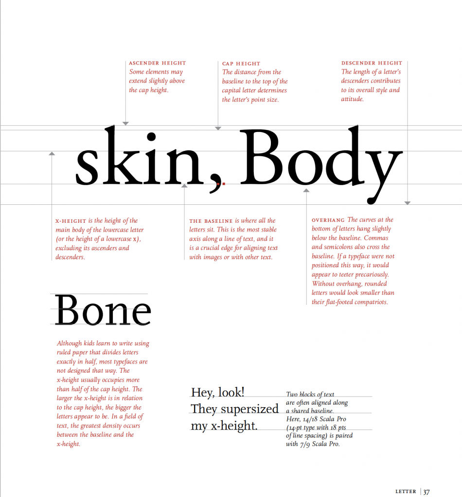
Ellen Lupton’s book, Thinking with Type, was a terrific resource this week. She combines useful nuts and bolts descriptions, interesting history lessons, with a variety of examples and exercises. A sense of humour and real love of the subject shine through, and her charts are packed full of information in an accessible manner. A good example are these anatomy charts, playing with the term “anatomy” in a light-hearted fashion, while also packing a huge amount of good information into them.
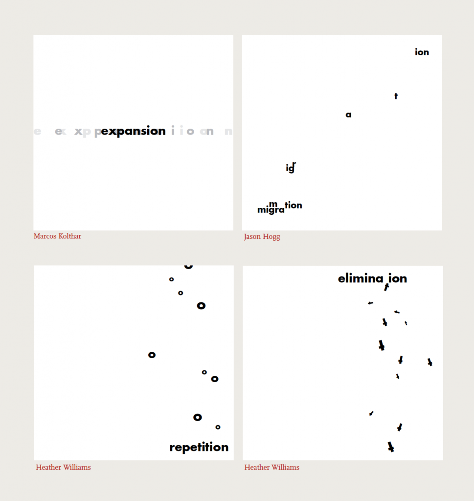
Or these student exercises in space and meaning, which were very relevant to our workshop task this week.
What I really learned from my teachers was not rules and facts but how to think: how to use visual and verbal language to develop ideas. For me, discovering typography was like finding the bridge that connects art and language.
Ellen Lupton
This lecture was also very interesting. Lupton speaks about how we process what we see, and how the alphabet is a powerful memory object. We can destroy or play with letterforms to a huge degree, and still fundamentally recognise them and take in their meaning. Our mind is always trying to simplify and create meaning out of what we see. She also spoke about overlapping meanings and messages, and that a lot of beautiful elements in graphic design come from this synchronicity, as well as the importance of narrative and experience.
Zsófia Szabó
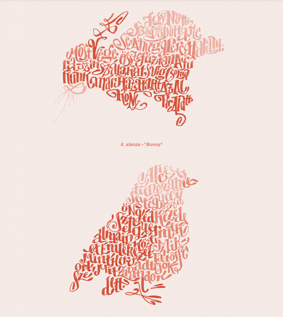
I loved these beautiful typgraphic poems designed by Zsófia Szabó. The hand lettering is beautiful and the shapes are simple but evocative.
I also enjoyed watching this short film about the last days of linotype at the New York Times. Linotype machines were a hot metal casting system for producing printing plates.
It made me feel quite nostalgic as my first proper job was in a newspaper. Although we may have moved on from linotype, I spent a lot of time setting articles and text for adverts into the ridiculous old bespoke system they used. It wasn’t quite pasteup, but it relied on faxing, scanning and was so ancient it couldn’t be on the same network as the system used by the journalist so I’d have to physically go upstairs and use a different machine for some bits of the job. In spite of this, I quite enjoyed working in copy control and making sure everything was in place.
Workshop Challenge
Take an excerpt from a national poet or writer and translate into a new typographic form
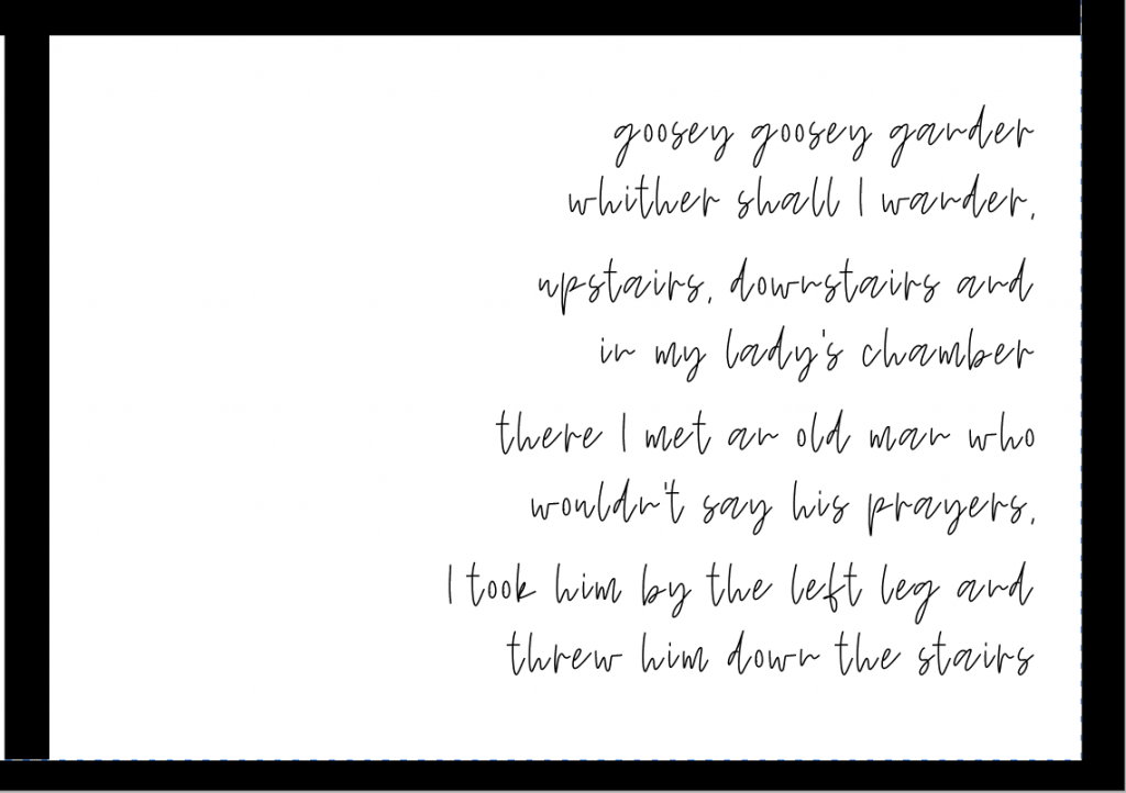
Typography is something I use every day, but is not something I feel I am naturally talented with. I’ve been using it for long enough that I’ve absorbed most of the technical aspects without really thinking about them, my struggle lies more with choosing the most effective typeface for a specific purpose, or using it to the best of its ability. I quite often have to try a few different options until I find one that feels right. I thought I’d try setting a nursery rhyme in a few contrasting ways to illustrate how different the same words feel just through type choices.
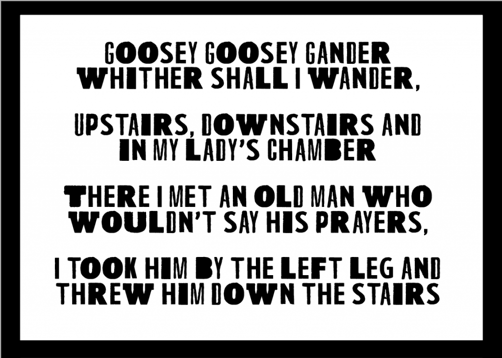
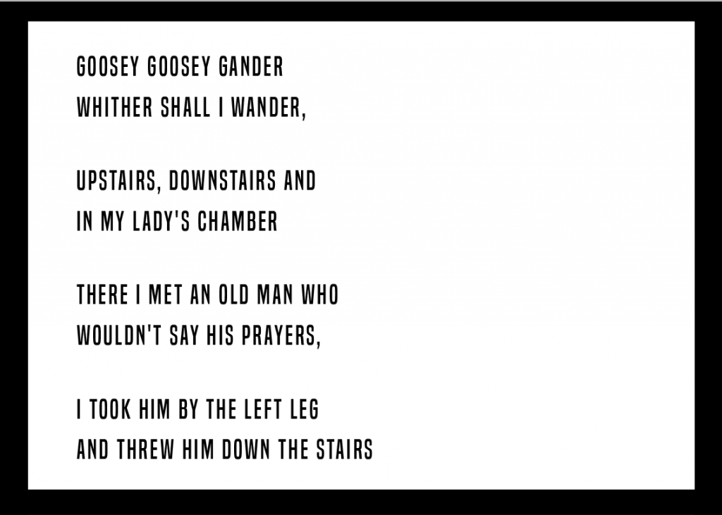
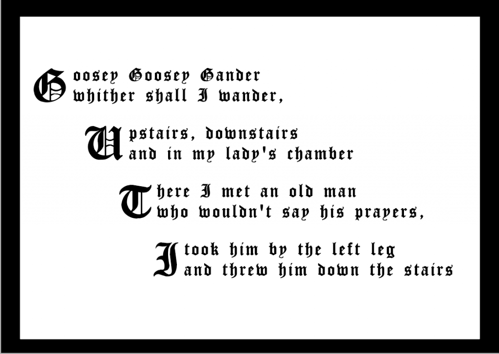
Using a bold, blocky and mixed weight typeface lends the rhyme an off centred and unsettling manner. The nursery rhyme is bizarre enough by itself, and doesn’t need any help! Setting the same words in a more contemporary, typeface feels very different. The third version was set in a traditional Olde English font, playing with dropped caps, and stepping each line to represent the stairs mentioned in the rhyme.
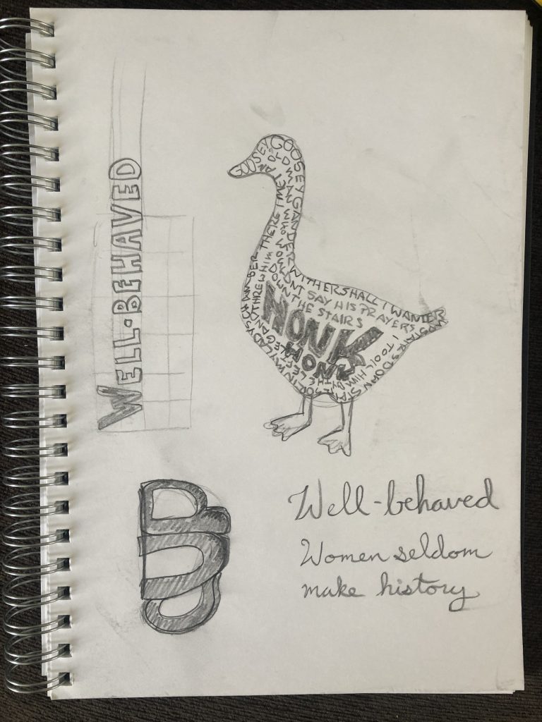

I set the rhyme in varied and contrasting ways, and ended up making a typographic illustration out of it. I feel like the shape went quite well, but I had a large gap in the middle when I got to the end of the poem. I filled it in with a bold “honk honk” and really like the weight and impact it ended up with. The issue is that it doesn’t quite balance with the rest of the poem. I want it to have either a similar weight throughout, or make the letters a bit larger so they are also bolder. Hand lettering is definitely not my strong point, but I would enjoy working more with this.
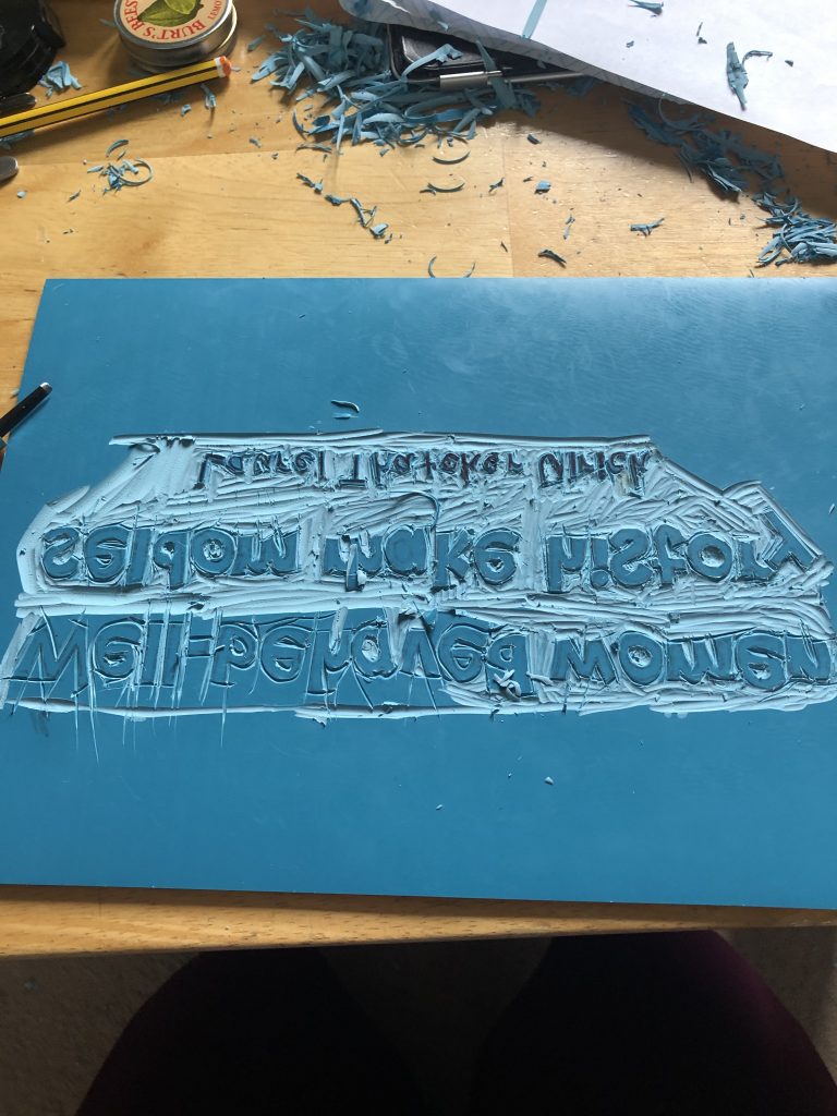
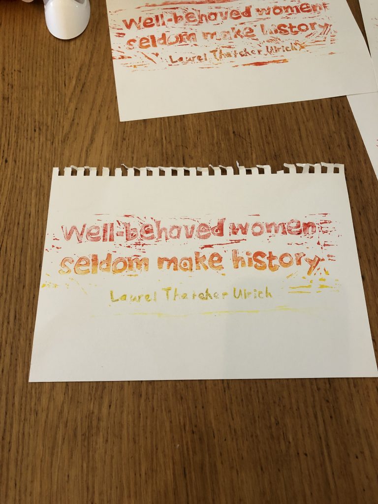
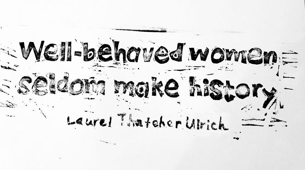
Well-behaved women…
I had a difficult time choosing a poem or quote for this week’s task. Even though the content was not the focus of the task, it felt like it was terribly important and nothing I looked at seemed like it was right.
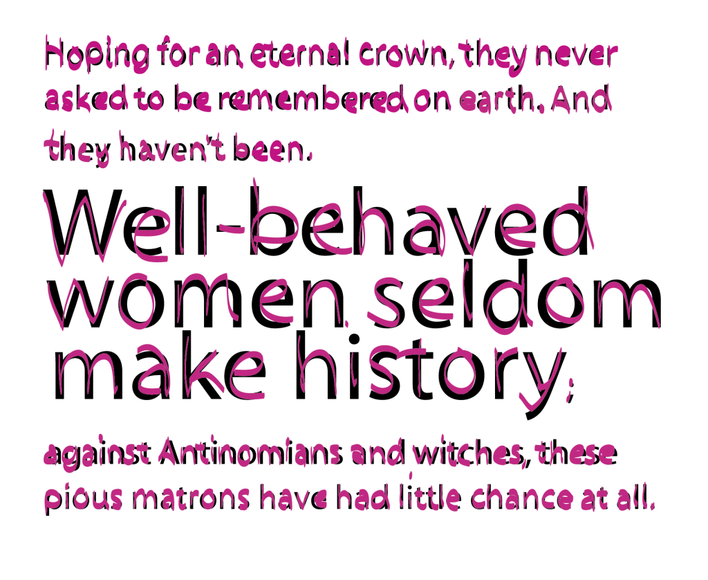
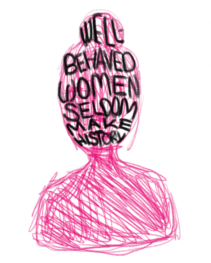
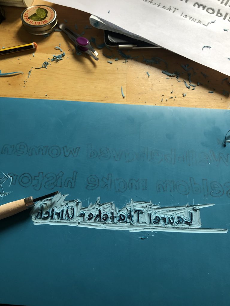
I ended up doing a linocut of Laurel Thatcher Ulrich’s quite famous quote “Well-behaved women seldom make history”. Ulrich is a personal hero of mine, a Pulitzer prize winning historian, a professor at Harvard, and a Mormon feminist icon. The quote quite often gets taken out of context, misquoted and splashed around without attribution. Ulrich has made a career out of examining the unexamined. The Pulitzer she was awarded in 1991 for A Midwife’s Tale is a fascinating look at Martha Ballard, an unknown rural midwife. Ulrich pieced together journal entries and cross referenced exhaustively to recreate Ballard’s world. The context of the original quote is more about how ordinary women are overlooked, rather than a call to “miss-behave” in order to make history. Ulrich’s points out that the history of ordinary women is only unknown because historians have never bothered to examine it.
“While telling the stories of these history-making women, Ulrich illuminates the intended meaning behind the slogan that is the title of her book. When the slogan appears out of context, it becomes open to wide interpretation, and has, subsequently, been used as a call to activism and sensational — even negative — behavior. In fact, Ulrich says, the phrase points to the reasons that women’s lives have limited representation in historical narrative, and she goes on to look at the type of people and events that do become public record.
“People express such surprise when they discover that women have a history. It is liberating that the past can not be reduced to such stereotypes,” says Ulrich. “I hope that someone would take away from this book that ordinary people could have an impact, and to try doing the unexpected. I would like to show that history is something that one can contribute to.” (Lavoie 2007)
Summary of the week
Because I was invested in doing a linocut this week, I feel like I focused more on getting to the cutting stage than laying out the quote. I had done a few options, but I don’t think I thought it through enough. I had ordered a new type of soft lino, and I severely overestimated my cutting skills and the scale of the piece. The soft lino was supposed to be easier and quicker to cut, but I found that the softness actually made it too easy to slip and take gouges out of areas I really did not want. The letterforms I had chosen were also far too small, with too much detail. I had thought I might do a monotype, but my inking surface wasn’t quite large enough.
I had some great feedback from the new style group crit and would love to develop this further.
References
BAINES, Phil and Andrew HASLAM. 2005. Type & Typography. London: Laurence King Publishing, Cop.
KUBEL, Henrik and Scott WILLIAMS. 2015. New Perspectives in Typography. London: Laurence King Publishing.
LAUREL THATCHER ULRICH. 1976. “Vertuous Women Found: New England Ministerial Literature, 1668-1735.” American Quarterly 28, [online], 20–40. Available at: http://www.jstor.org/stable/2712475.
LAVOIE, Amy. 2007. “Ulrich Explains That Well-Behaved Women Should Make History.” Harvard Gazette [online]. Available at: https://news.harvard.edu/gazette/story/2007/09/ulrich-explains-that-well-behaved-women-should-make-history/ [accessed 28 Nov 2020].
LUPTON, Ellen. 2010. Thinking with Type: A Critical Guide for Designers, Writers, Editors, & Students. New York Princeton Architectural.
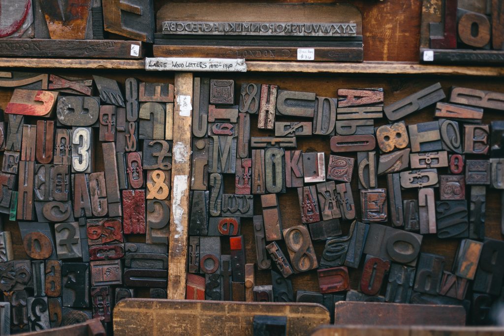
MARTINS, Bruno. 2015. “Assorted Wood Stamps.” Unsplash.com [online]. Available at: https://unsplash.com/photos/OhJmwB4XWLE [accessed 2 Dec 2020].
NEW YORK CITY: EDUCATIONAL MEDIA COLLECTION/UNIVERSITY OF WASHINGTON. 2016. “FarewellEtaoinShrdlu.” YouTube. Available at: https://www.youtube.com/watch?v=1MGjFKs9bnU [accessed 26 Nov 2020].
OETTING, Jami. 2016. “28 Brands That Go By Different Names in Different Countries [Infographic].” Hubspot.com [online]. Available at: https://blog.hubspot.com/agency/brands-different-names-different-countries-infographic [accessed 5 Dec 2020].
SAADE, Gabriela. 2019. “Well-Behaved Women Seldom Make History – Gabriela Saade – Medium.” Medium [online]. Available at: https://medium.com/@gabrielasaadeg/well-behaved-women-seldom-make-history-dc92886d3a5d [accessed 28 Nov 2020].
SOELLING, Kristoffer. 2020. Week 10 Typography [lecture]. GDE710 for MA Graphic Design. Falmouth: Falmouth University 2020 [Accessed 2 Dec 2020]