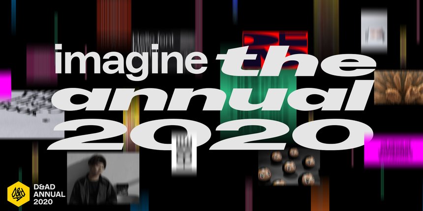
Case studies: The Effect of Globalisation on Design
Guest Lecture: Harriet Ferguson
Drawn Here (and There) – film by Non Format
This week we’ve watched several lectures about the effect of globalisation on design. My initial feelings were that globalisation has had a tremendous effect on my personal life, and next to no effect on my professional life. The lectures have made me rethink that position. My marriage and children are a direct result of globalisation and the connective power of the internet. My family is split across continents and I have friends and family all over the world. My professional life is in general very local, working mostly with clients in the same county and country. I had discounted the small freelance projects I do, which have mostly been with international clients, the local clients I have with an international background and the influence that globalisation brings to design trends and awareness. Being an immigrant from America also informs the way I think, America is so used to considering itself the centre of the world, the idea that someone would want to leave it can be baffling and almost offensive to some. Globalisation is a counterpoint to the the melting pot ideal of America, to share culture and experience without becoming too homogenised, or losing what makes community and culture unique.
“Globalisation has added a lot of speed to life, it’s added a lot of connectivity to it, but I
don’t think it’s necessarily changed some quite basic things about how we operate.
I think people are still responding to other humans the most, that’s what makes the most
impression. And objects, I’m a big fan of objects, as in print and stuff, I think that digital
works only so far, before, as a human, you have to get up and get off the machine, because
you feel a bit weird.” Sam Winston (Winston, 2020)
Sam Winston brings up interesting points, but I’m not sure I agree with his last point about digital work. I think digital work is going to have an increasing value and importance. Far from people switching off, we are on the cusp of technology being an ever present and constant companion, to the point where we even speak about technology addiction. The current generation are classed as digital natives, unable to comprehend not having instant access to everything – news, entertainment, education, shopping. I do agree with Sam Winston that getting up and off of the machine is important, being hyper connected is not necessarily good for people, and engaging with life and the environment around you is crucial for relationships and mental health.
The points Harriet made about being aware of cultural meaning and references were also very important and engaging (Ferguson, 2018.) I’ve been on the wrong side of the US/UK language divide more than once, which has led me to be very careful with certain word choices around my children.
I found the example of the Apple ads to display a high level of cultural awareness and thoughtfulness in the production of the spots, a level of care that would be unknown by any one viewer in a particular place. This is a very sensitive treatment of an issue advertising on a global level creates – bad dubbing can be almost instantly noticed and irritates viewers. Emotional engagement with a brand is damaged when consumers feel they are a secondary market, authenticity and connection is always something to strive for.
As Harriet said – Think globally, act locally. (Ferguson, 2018)
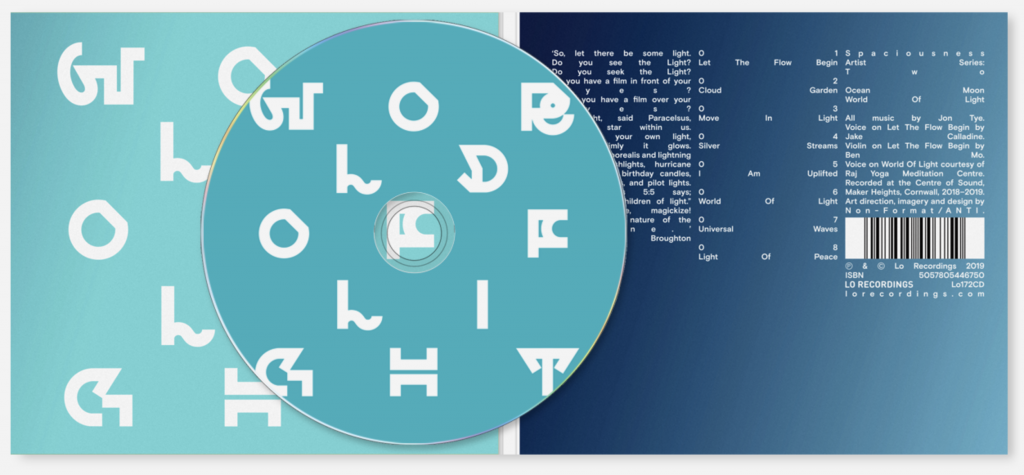
Our last resource was a filmed lecture by Non-Format. (Non-Format, 2010) I very much enjoyed the evolution of their career and the discussion of the practicalities of having a design team split across time zones. I’m very aware of the pitfalls of working across time zones, and after 17 years I still have family members unable to remember to add seven hours to the time! What struck me was the emphasis on typography, moving from type on image, to type as image, to movement as the next step, and the willingness to experiment without having a technical skillset first. Kjell Ekhorn humorously mentioned that “having a lack of intelligence has never been a problem for us.” (Non-Format, 2010). Being open to new techniques, collaborating with others who have the technical skills you lack, and learning new skills are all very important skills to develop as a designer.
I also enjoyed Jon Forss’ admission to being influenced by the fashion of things, and his discussion of how design goes through a cycle of being in and out of taste, that there is “no fixed point at which something is good.” (Non-Format, 2010).
Workshop Challenge 1
Explore the categories of the D&AD award winners and consider how this impacts on your views of design terminology, consider the overlaps and points of change, difference and similarity.
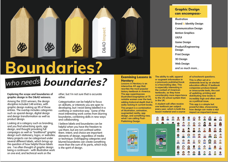
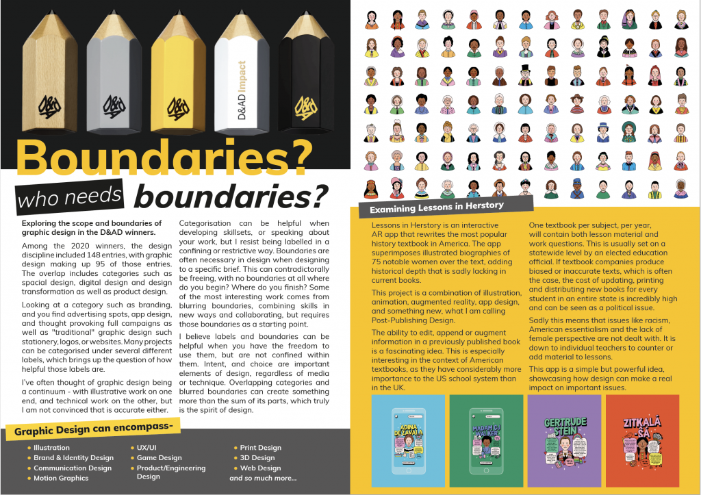
I found this challenge to be very interesting, but also overwhelming and at times confusing. The sheer amount of work included was a bit daunting, and not all of the projects were clear from the entry page. I appreciated projects with a bit more explanation, whether that was in the form of a short film about the project, a more in-depth explanation, or even multiple photos. Among the 2020 winners, the design discipline included 148 entries, with graphic design making up 95 of those entries. The overlap includes categories such as spacial design, digital design and design transformation as well as product design. Looking at a category such as branding, and you find advertising spots, app design, and thought provoking full campaigns as well as “traditional” graphic design such stationery, logos, or websites. Many projects can be categorised under several different labels, which brings up the question of how helpful those labels are. Labels can both expand and constrict, at times they are necessary to create understanding and can be useful to communicate who you are and what you do, but can also be used to pigeonhole and restrict. I believe labels are useful when you choose to use them, rather than something enforced on you.
Workshop Challenge 2
List 10 different types of graphic design practice today.
Choose a piece of design that breaks definitions of design practice and write a paragraph describing this practice.
Come up with a new term that describes this area of work.
Graphic Design can encompass-
Illustration
Brand and Identity Design
Communication Design
Motion Graphics
UX/UI
Game Design
Product/Engineering Design
Print Design
3D Design
Web Design
and so much more. It would actually be easier to keep listing types of design than to just pick 10. I think one of the things that makes this hard to categorise is that designers rarely stick to one specific sub-category of design, and many overlap. Job listings certainly don’t! HR departments often list a job opening for a designer and cram five or six wildly different positions into one. I’ve often thought of graphic design being a continuum – with illustrative work on one end, and technical work on the other, but I’m not sure that is accurate either. Categorisation can be helpful to focus on skillsets, or interests you are open to developing, but I resist being labelled in a confining or restrictive way. Some of the most interesting work comes from blurring boundaries and combining skills in new ways and collaborating.
In my career as a print designer I am often working within an established brand or identity. It becomes my job to blend in, matching the tone and branding as seamlessly as possible. While I am very good at this, I also find it frustrating, as I make myself invisible, and sometimes need to cater to terrible ideas from clients. Print can be very much design as a service industry. Unless a client is outright abusive, I must put aside personal preference and do my best to produce work that is effective and on brand. I call this Chameleon Design. Complete freedom of expression in design I see as a privilege, which comes from either a place of financial and reputational power, or personal work striving to establish that position of power. If I’m lucky I develop enough of a relationship with a client that I am able to get them to broaden the brief or listen to my suggestions. Often all I can do is give them options in which I’ve snuck a different idea and hope they might be suggestible, but I’ve had to create plenty of work I would not want my name on.
A project I felt blurred these lines was Uncontrolled Type by Plotter Drawing. A combination of typography, print design, programming, and plotter drawing. The exhibit consisted of large format prints of a typographic alphabet and art books produced using a Graphtec plotter. Plotters use vector information to cut or draw paths, they were often used for large scale technical drawings.
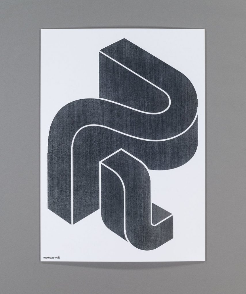
The works for Uncontrolled Type were created using a pen holding adaptor, moving the paper back and forth along programmed paths. The build up of lines creates lovely texture, with line upon line upon line, blending and moving together. The typography was hand designed, then taken into Illustrator and treated to result in complicated 3D shapes that could be programmed for plotting. A variety of drawing tools were used, creating more texture and differences between pieces. The letter “A” was created using a flexible brush pen, resulting in a variable stroke and creating great depth on areas where the vector information overlaps. In contrast the “C” form was created using a pencil, the softer graphite blurring and blending slightly as the pencil moved.
I enjoyed both the abstract letterforms and the technology used to create the finished work. Analogue techniques mixed with digital design create something greater than the sum of its parts, which is one of the hallmarks of good design.
Uncontrolled Type by Plotter Drawing won a D & AD Wood Pencil in 2018. The agency behind it, Sha Inc., won another Wood Pencil in 2019 for The Origin of Life, another combination of programming and design.
Examining Lessons in Herstory
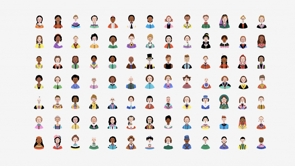
Lessons in Herstory is an interactive AR app that rewrites the most popular history textbook in America. The app superimposes illustrated biographies of 75 notable women over the text, adding historical depth that is sadly lacking in current books.
This project is a combination of illustration, animation, augmented reality, app design, and something new, what I am calling Post-Publishing Design.
The ability to edit, append or augment information in a previously published book is a fascinating idea. This is especially interesting in the context of American textbooks, as they have considerably more importance to the US school system than in the UK.
One textbook per subject, per year, will contain both lesson material and work questions. This is usually set on a statewide level by an elected education official. If textbook companies produce biased or inaccurate texts, which is often the case, the cost of updating, printing and distributing new books for every student in an entire state is incredibly high and can be seen as a political issue.
Sadly this means that issues like racism, American essentialism and the lack of female perspective are not dealt with. It is down to individual teachers to counter or add material to lessons.
This app is a simple but powerful idea, showcasing how design can make a real impact on important issues.
Editorial outcome
Initially the header image broke across the page divide, but that left me with no space for the list of ten design terms on the left hand side, and an awkward space around them on the right. I also did not have space for the images I wanted to feature at the bottom.
I replaced the bottom images with a  tidier grid that also supplied pops of colour, and posted this as my first draft on the Ideas Wall. I had good feedback from Paul about spacing and made more changes.
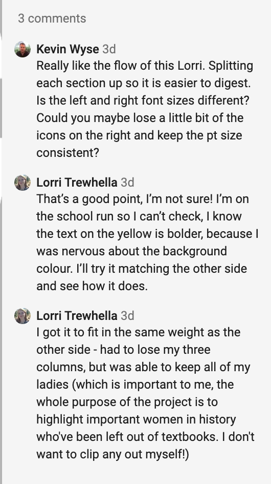
I received more feedback, this time from Kevin Wyse. I had been nervous about the bold colours, but with encouragement from Paul and Kevin I matched the font weight on both pages. This balanced much better and is clean and clear. I was disappointed to lose the impact of the first header, but the changes were all positive in the end.
Summary of the week
There are definite pros and cons to globalisation – the ability to reach a wider audience with your work also means that it is easy to get drowned out by the sheer amount of designers available. Predatory sites like 99designs pit designers against each other to do spec work for free, and jobs are outsourced to countries with lower cost of living. Inspiration may be easier to find, but that comes with the danger of cookie cutter copycat design as well. The balance to this is human connection and authenticity in work. The running theme through the last few weeks for me has been that design is a way of thinking, rather than a specific thing we do. Labels and categories can be helpful, but should descriptive, not restrictive.
References
BORIS, S., FINN, T., HOUSE, J., MANCHIPP, S., SOELLING, K., WINSTON, S. 2020. Week 3 The Effect of Globalisation on Design [lecture]. GDE710 for MA Graphic Design. Falmouth: Falmouth University 2020 [Accessed 4 October 2020]
D&AD. 2020. “Adobe Presents: D&AD – Insight Session: Design | Adobe UK.” YouTube. Available at: https://www.youtube.com/watch?v=c04QRpM65LA&feature=youtu.be [accessed 5 Oct 2020].
FERGUSON, Harriet. 2020. Week 3 The Effect of Globalisation on Design [lecture]. GDE710 for MA Graphic Design. Falmouth: Falmouth University 2020 [Accessed 4 October 2020]
“Lessons in Herstory.” 6AD. www.dandad.org [online]. Available at: https://www.dandad.org/awards/professional/2020/232678/lessons-in-herstory/ [accessed 2020 Oct 6AD].
NON-FORMAT. 2010. “Drawn Here (and There): Non-Format.” YouTube. Available at: https://www.youtube.com/watch?v=96R2vgcFg_Y&feature=youtu.be [accessed 3 Oct 2020].
Non-Format. 2019. Ocean Moon – World Of Light — Music Packaging. Available at: http://non-format.com/ocean-moon-world-of-light.
“SHA Inc.” 2020. SHA inc. [online]. Available at: https://shainc.co.jp/?content=work/uncontrolled_types [accessed 6 Oct 2020].